#1662: New Macs, 12 top OS features for 2023, vertical tabs in Web browsers, watchOS 9.5.1
Apple’s whirlwind WWDC keynote led off with a new 15-inch M2 MacBook Air, new M2 Max and M2 Ultra models of the Mac Studio, and the long-awaited Mac Pro with Apple silicon—read on for the details for the Macs that mark the end of the Intel era at Apple. After that, the keynote segued into previewing features we can look forward to later this year in iOS 17, iPadOS 17, macOS Sonoma, watchOS 10, and tvOS 17. Adam Engst shares the 12 features he found most interesting. What you won’t find in this issue is coverage of Apple’s Vision Pro “spatial computer,” due early next year starting at $3499. We need more time to ponder the implications before committing our thoughts to print. In the here-and-now, Adam also looks at vertical tab support in a wide range of Web browsers and gives a curt nod to the poorly described watchOS 9.5.1. Notable Mac app releases this week include 1Password 8.10.7, Quicken 7.1, DEVONthink 3.9.1, Audio Hijack 4.2, BusyCal 2023.2.3 and BusyContacts 2023.2.1, and Camo Studio 2.0.3.
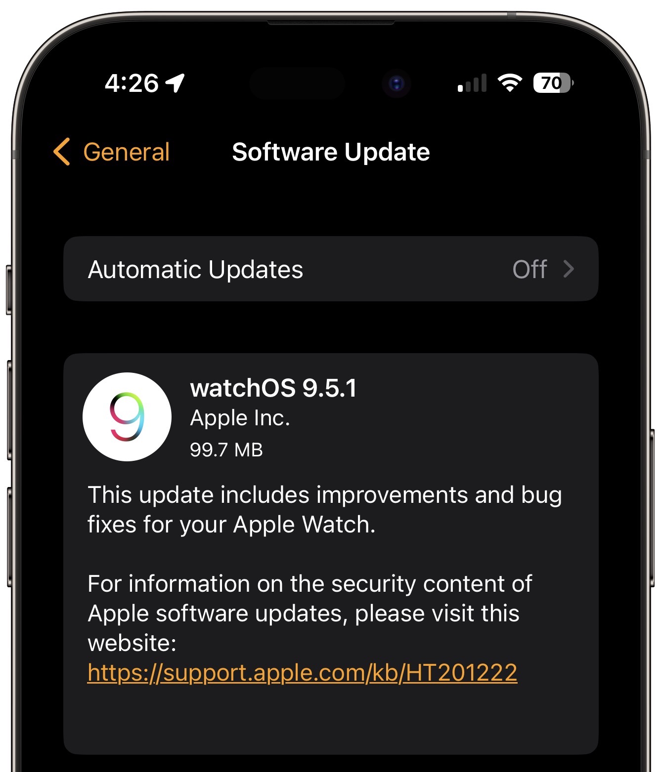
watchOS 9.5.1 Probably Fixes Some Problem
In an update that you’d be forgiven for missing, Apple has released watchOS 9.5.1 with the traditionally unhelpful “improvements and bug fixes.” (The watchOS 9 Updates page still lacks even that information.) Apple’s Security Updates page also says, “This update has no published CVE entries.” It’s unclear whether that means it fixes vulnerabilities without CVE entries or doesn’t include any security fixes at all. Channeling Apple’s lack of enthusiasm and specificity, I recommend installing this update sometime when it’s convenient and you happen to remember. The main reason to install sooner is if you’re trying to solve a problem with your Apple Watch, such as perennially amorphous battery life issues or a weird green tint.
Three New Macs Complete the Apple Silicon Transition
Watching the start of Apple’s WWDC keynote today felt a bit like watching an American football team score on a long touchdown pass on the first play of the game… and then come back to do it again on its next two possessions. That first score was the announcement of the 15-inch M2 MacBook Air, followed quickly by a new Mac Studio powered by the M2 Max or the new M2 Ultra and then the long-awaited Mac Pro, also based on the M2 Ultra. All three Macs are available for order today and will be shipping 13 June 2023.
Although the specs and prices of the new Macs are impressive, there isn’t that much to say.
15-inch M2 MacBook Air
The new 15-inch MacBook Air is easy to understand. It’s just like the 8-core CPU/10-core GPU model of the 13-inch M2 MacBook Air, with a larger screen and more speakers. As far as I can tell from a comparison of the specs, it’s otherwise identical.
The screen is a 15.3-inch Liquid Retina display with a native resolution of 2880 by 1864 at 224 pixels per inch. That’s the same pixel density as the 13-inch M2 MacBook Air, but a bit coarser than the MacBook Pro at 254 pixels per inch. The 14-inch MacBook Pro, despite having a smaller screen, has a higher native resolution of 3024 by 1964, and the 16-inch MacBook Pro has a native resolution of 3456 by 2234. The MacBook Pro models also boast Extreme Dynamic Range (XDR) with a higher contrast ratio and brightness when displaying HDR content.
For audio, the 15-inch MacBook Air picks up the same six-speaker sound system with force-canceling woofers that the larger MacBook Pro models enjoy; that’s up from four speakers in the 13-inch MacBook Air.
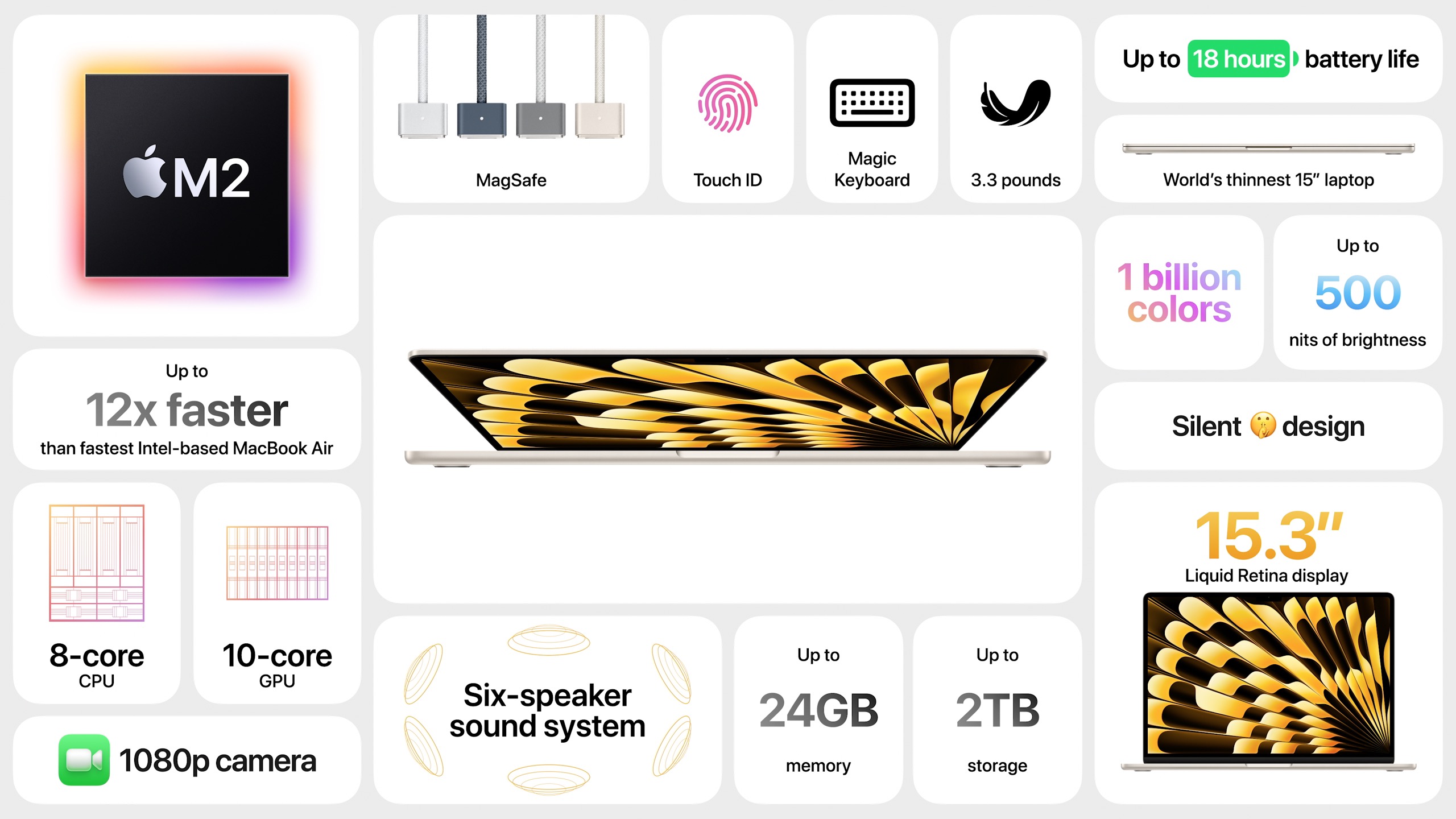
Beyond that, everything is the same between the two M2 MacBook Air models:
- Apple M2 with 8-core CPU, 10-core GPU, and 16-core Neural Engine
- 8 GB of unified memory, upgradeable to 16 GB or 24 GB
- 256 GB, 512 GB, 1 TB, and 2 TB storage options
- Wi-Fi 6 and Bluetooth 5.3
- 1080p FaceTime HD camera
- MagSafe 3 charging port
- Two Thunderbolt / USB 4 ports
- 3.5 mm headphone jack
Although the battery in the 15-inch model is larger, even battery life is the same, estimated at 15 hours for “wireless web” and 18 hours for “Apple TV app movie playback.” Both come with a 35W Dual USB-C Port Compact Power Adapter and are fast-charge capable with a 70W USB-C Power Adapter.
Impressively, despite the larger screen, the 15-inch model is only 0.89 inches (2.26 cm) deeper and 1.43 inches (3.63 cm) wider than the 13-inch model, and just a hair thicker. It’s just 3.3 pounds (1.51 kg), just 0.6 pounds (0.27 kg) heavier than its smaller sibling.
Pricing for the 15-inch M2 MacBook Air starts at $1299 for 8 GB of memory and 256 GB of storage. It’s available in silver, starlight, space gray, and midnight colors, just like the 13-inch model. Simultaneously, Apple dropped the price of the 13-inch M2 MacBook Air by $100, so it now starts at $1099. The 13-inch M1 MacBook Air remains available starting at $999.
Frankly, the 15-inch M2 MacBook Air looks like a brilliant machine, and I believe it will be as well-received as the 13-inch model, which Apple claims is the world’s best-selling laptop.
M2 Max/Ultra Mac Studio
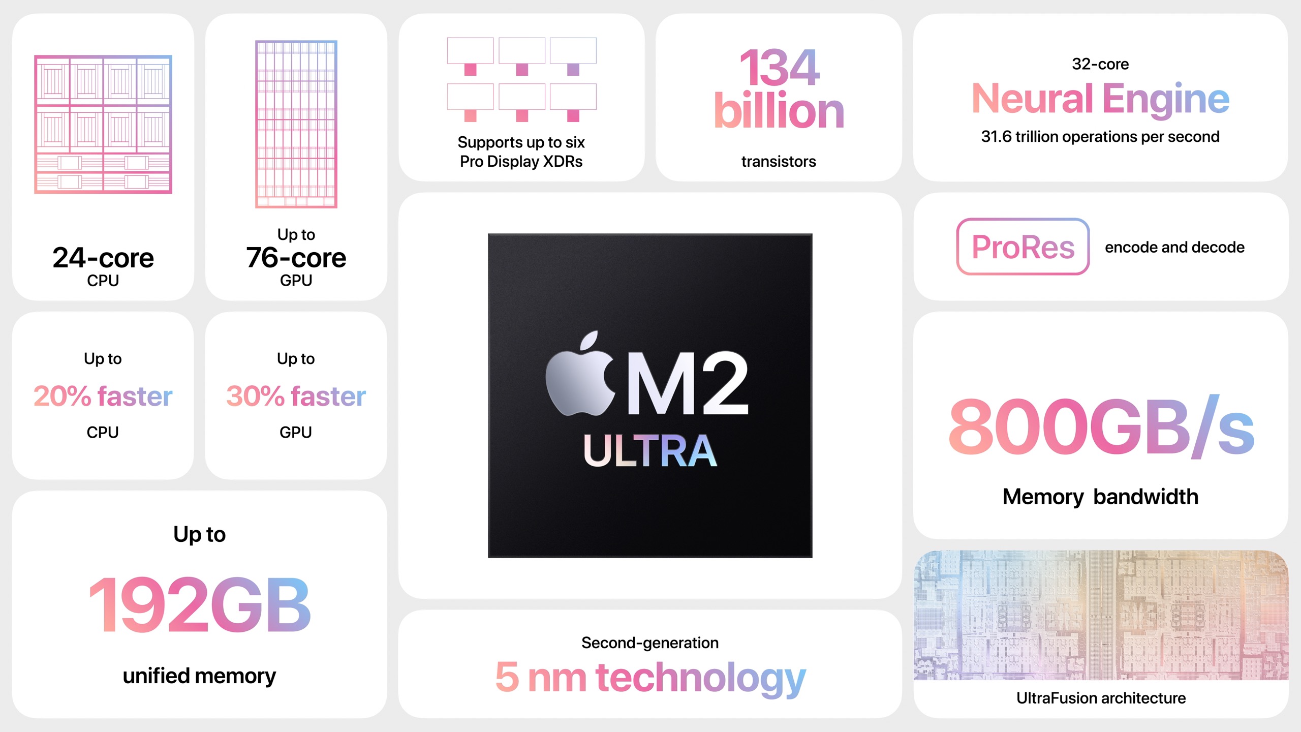
Next up in Apple’s whirlwind march down the field was the Mac Studio. Here the story is all about the chip inside. The previous generation of Mac Studio models used the M1 Max and M1 Ultra, so it’s no surprise that Apple introduced an M2 Ultra to join the M2 Max that was previously available only in the 14-inch and 16-inch MacBook Pro.
The M2 Ultra chip is, as one would expect, two M2 Max chips jammed together, essentially doubling the M2 Max’s specs. That means the M2 Ultra has:
- 24-core CPU with 16 performance cores and 8 efficiency cores
- 60-core GPU
- 32-core Neural Engine
- 800 GB/second memory bandwidth
- Unified memory starting at 64 GB and configurable to 128 GB or 192 GB
It can also drive an insane number of displays:
- Eight displays with up to 4K resolution at 60Hz
- Six displays with up to 6K resolution at 60Hz
- Three displays with up to 8K resolution at 60Hz
Compared to the M1 Ultra, Apple claims the M2 Ultra is 20% faster for CPU operations, 30% faster for GPU operations, and 40% faster for the Neural Engine.
Although 20–30% performance improvements are nothing to sneeze at, it may not be worth upgrading from an M1 Max or M1 Ultra Mac Studio. Apple nods to this fact by comparing the new Mac Studio models to the fastest Intel-based iMac, claiming 400% or 600% performance improvements. We’re still getting no hints that Apple might update the 27-inch iMac to Apple silicon.
A look at the new Mac Studio’s specs reveals no significant differences between the M1 and M2 Mac Studio models apart from the performance improvements, higher memory ceiling, and a newer version of Bluetooth, I see. They offer the same ports, wireless connectivity, and so on.
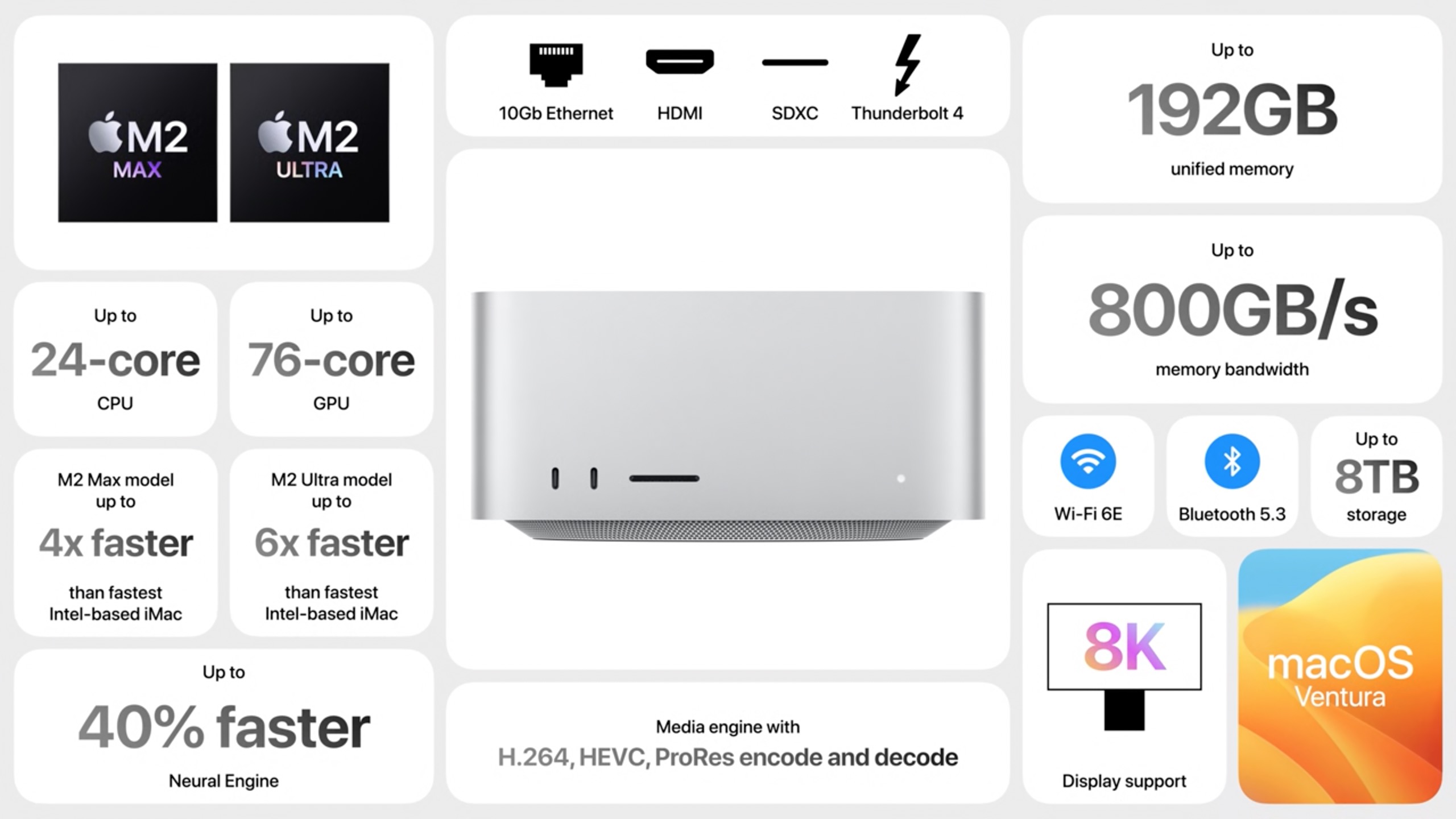
As before, the M2 Max Mac Studio starts at $1999 and the M2 Ultra Mac Studio starts at $3999. They aren’t cheap, but if you need the performance, the Mac Studio has it to burn.
M2 Ultra Mac Pro
In its final Mac announcement of the day, Apple unveiled the Mac Pro with Apple silicon, dropping the final Intel-based Mac from its lineup. Based on the M2 Ultra chip, the Mac Pro’s base specs will be exactly the same as the M2 Ultra Mac Studio—that’s how things work with Apple silicon. It uses the same case—complete with the $400 optional wheels—as the Intel-based Mac Pro.
Where the Mac Pro stands out, however, is in its support for PCI cards. It offers six open full-length PCI Express gen 4 slots; the Intel-based Mac Pro had seven open gen 3 slots. Both devote one half-length x4 PCI Express gen 3 slot to the Apple I/O card. It also has eight built-in Thunderbolt 4 ports, six on the back and two on the top (tower enclosure) or front (rack enclosure)—that’s twice as many as its predecessor.
Although Apple claims that the new Mac Pro is 3–7 times faster than the previous Intel models, the comparison becomes a little tricky. For instance, Apple sold the Apple Afterburner accelerator card for the Intel-based Mac Pro, but the M2 Ultra chip’s dedicated silicon supposedly provides performance that’s the equivalent of seven Afterburner cards. And while the Intel-based Mac Pro offered numerous RAM configurations from 32 GB to 1.5 TB, we know that the unified memory in Apple silicon is far more efficient, so the new Mac Pro maxing out at 192 GB might not be an issue at all.
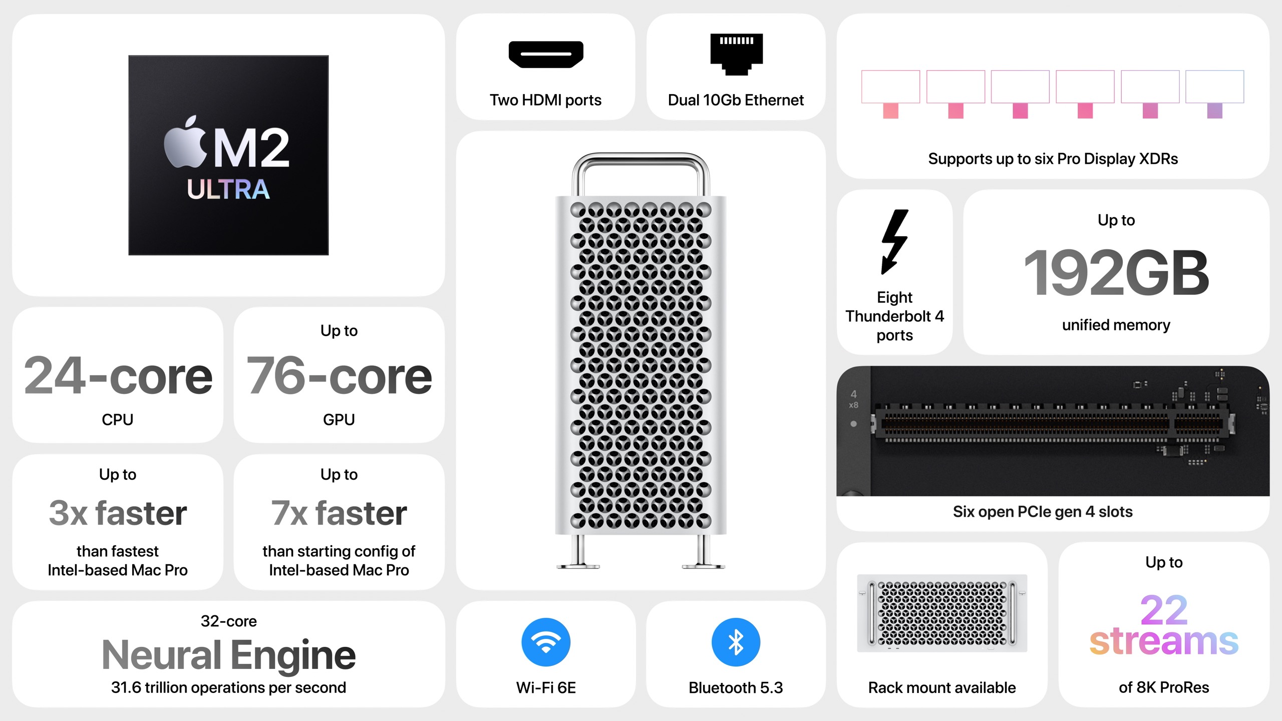
The prices are still eye-watering. The tower version starts at $6999, and the rack-mount version starts at $7499. The available options almost double the price. Nonetheless, a Mac Pro tower with every option looks like a bargain at $12,199 compared to the fully specced Intel-based Mac Pro, which clocked in at nearly $53,000 (see “2019 Mac Pro and Pro Display XDR: Big Iron for Big Bucks,” 10 December 2019). Still, if just the base price makes your eyes twitch, you can’t afford a Mac Pro.
Apple couldn’t have known that this would be a poor time to introduce its most powerful Macs ever, given that Hollywood is a target audience for the Mac Studio and Mac Pro. Much production has been halted thanks to support workers refusing to cross picket lines associated with the current Writer’s Guild of America strike—bolstered by a campaign targeting Apple to protest the company’s participation in the Alliance of Motion Picture and Television Producers. There’s also the threat of another strike by the Screen Actors Guild, so large production companies are more likely to cut costs and lay people off than order Apple’s latest hardware.
12 Compelling Features Coming to Apple’s Operating Systems in 2023
Apple took more time in the WWDC keynote to discuss what’s coming in its 2023 operating system releases than it did to introduce its new Macs (see “Three New Macs Complete the Apple Silicon Transition,” 5 June 2023). Even still, the company’s presenters focused on only a handful of features in each operating system.
We did learn the new name for macOS 14—in a nod to California’s wine country, it will be macOS Sonoma. I feel funny putting that detail up front, but it feels important given how commonplace the macOS name becomes in our vocabulary for the next few years. At least Sonoma seems like it should be easy to say and spell for most people, so it will hopefully generate fewer mistakes like Mohave, Big Sir, and Venture.
There’s no way to cover even those features that Apple highlighted in the keynote, much less the many others it describes in preview pages on its website. Instead, I focus here on 12 features I look forward to trying or find generally compelling, in no particular order. For a list of everything coming in 2023’s operating systems—and Apple’s descriptions of the features below—see:
All these operating systems are available in beta form for developers now, will appear in public beta form for everyone soon enough, and should ship in the usual September/October time frame.
Contact Posters
We’ve been able to specify what photo we want to share with others for some time—those appear in Messages, Contacts, Phone, and more. In iOS 17, you’ll be able to create a custom Contact Poster containing your name over a photo or Memoji, and it will appear to others whenever you call. And before you ask, Apple’s Communication Safety protections cover it, so you shouldn’t have to worry about seeing someone’s naughty photo of themselves when they call.

No More “Hey” with Siri
It may take a while to retrain my brain, but Apple says that we’ll be able to drop the “Hey” from “Hey Siri.” Given how many times per day I invoke Siri to turn lights on and off, set scenes, make reminders, and more, I’ll appreciate being able to use one less word. Alas, Apple said nothing about a new version of Siri that might take advantage of modern machine learning techniques for improved recognition and more fluid responses. I don’t want Siri to incorporate ChatGPT, but the current token-matching approach for commands is increasingly unimpressive.
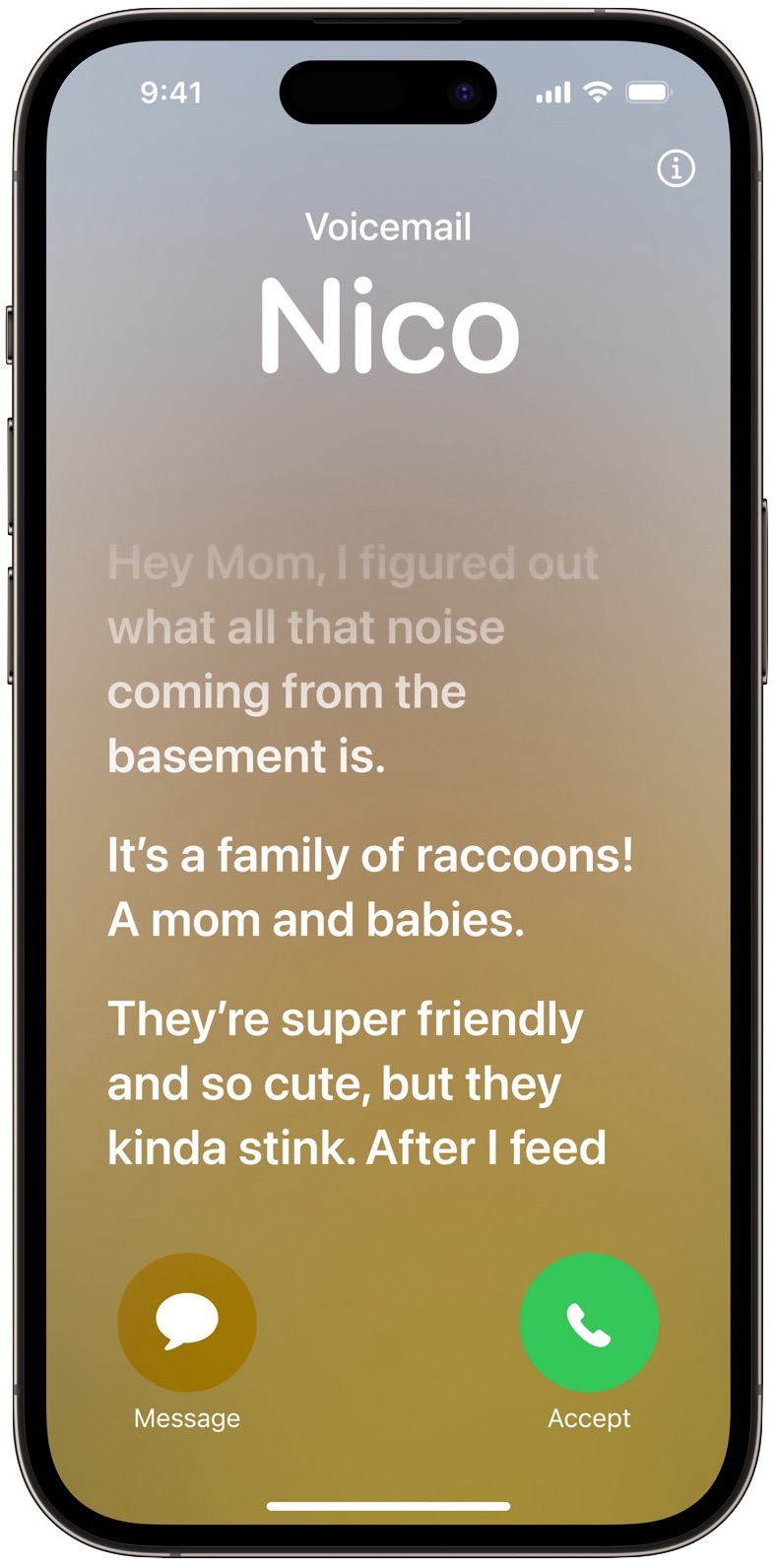
Live Voicemail
I rarely answer calls from unknown numbers anymore because they’re nearly all spam calls. In most cases, I end up with a 90-second voicemail of a staticky phone line but no actual message. iOS 17’s Live Voicemail feature may block those outright, but when a person is talking on the other end, it will provide a real-time transcription of the message so you can see if you want to pick up. All transcription is handled on the iPhone to ensure privacy.
Dictatyping on the Mac
In iOS 16, Apple enhanced dictation so you could speak and use the keyboard simultaneously. That was a big win, and even though Dictation still hasn’t gained the helpful editing capabilities of Voice Control, I regularly dictate to my iPhone. With macOS Sonoma, that feature is coming to the Mac, and it may be what finally lets me use dictation for some of my writing.
FaceTime Apple TV Support
FaceTime is a distant third among the video calling systems we use. Zoom rules for everything related to Tonya’s work at Cornell and our meetings for the Finger Lakes Runners Club. We use Google Meet for family calls because some of them have Google Nest Hub Max smart speakers with video screens. But FaceTime’s new option to use an iPhone or iPad camera on an Apple TV via Continuity Camera would let us take video calls from the couch in the living room and see the other people on our big screen TV. It’s too bad Apple couldn’t have implemented this feature during the pandemic lockdowns before videoconferencing habits became so ingrained.

Messages Reaction Stickers
Apple spent an inordinate amount of time talking about iMessage stickers, and I tuned nearly all of it out while thinking uncharitable thoughts—during Tristan’s childhood, stickers seemed to feed a troubling “Ooo, shiny!” acquisitiveness among some of his peers. But then I heard that we’ll be able to use stickers as reactions to messages. I find the tapback icons in Messages helpful but limiting, so I may put a little effort into creating a set of personalized response stickers. Penguins, yes; Disney princesses, no.
PDF Form Filling
Could Apple be about to upgrade Preview in a tangible way after all these years? Apple says enhanced PDF functionality allows for quick form-filling with AutoFill looking up your information from Contacts. This feature works in iOS 17, iPadOS 17, and macOS Sonoma, but Apple emphasizes it for iPadOS 17, where it will require a relatively recent iPad. This form-filling capability will apparently work even with scanned PDFs; we’ll see if it works with random PDFs not designed for form-filling.
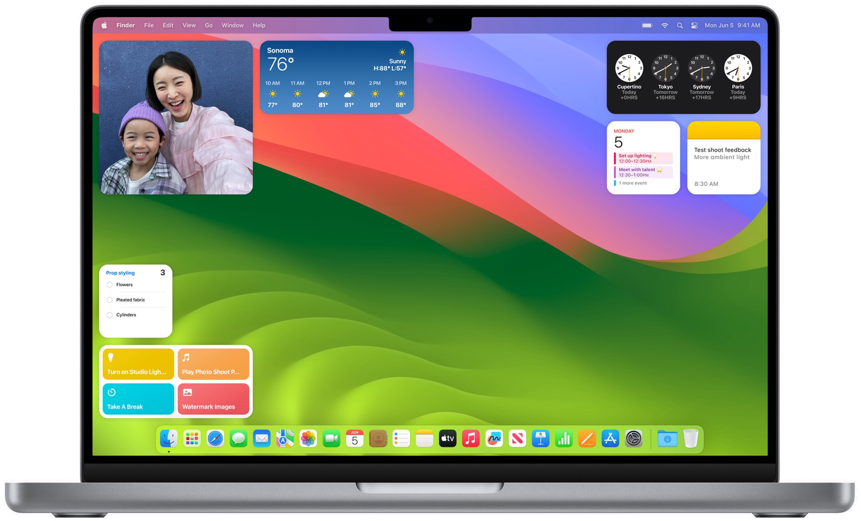
Mac Desktop Widgets
It’s about time. macOS Sonoma will let you drag widgets from Notification Center, where I have literally never used them, to the Desktop. Even better, you’ll also be able to put iPhone widgets on your Mac, thanks to Continuity—the widgets will actually be running on the iPhone that’s nearby or at least on the same Wi-Fi network. That said, the only widget I use anywhere is CARROT Weather on the iPhone, so we’ll see if any widgets become more compelling on the Mac.
Check In
Whenever my family left my grandparents’ house for a long drive home, we’d be admonished to “Call when you get home.” (Probably due to the trip when my parents’ beater car broke down late at night after dropping me off for vacation, and my grandparents and I had to go rescue them. That car finished its life on blocks with a screw wood splitter replacing a rear wheel and a garden hose running straight into the extremely leaky radiator.) Nowadays, most people would probably text when they arrive home safely, but Apple aims to automate it all with the new Check In feature. It alerts a family member or friend when you arrive home safely, and if you stop making progress, it checks in with you. If you don’t respond, it shares information about your location and iPhone status with the other person. All end-to-end encrypted, of course.
Share Phone Numbers with NameDrop
Trading phone numbers with someone is always awkward, with you dictating it to the other person or handing them your phone to type it in. The new NameDrop feature leverages AirDrop, so you can just bring your iPhone next to another iPhone (both running iOS 17, I’m sure) to trigger a contact exchange. Contact Posters will appear, of course, and you’ll be able to pick the data you want to share before initiating the transfer. Bringing iPhones close together will also work for initiating AirDrop transfers.

AirTag Sharing
Finally! Find My will allow sharing AirTags and other Find My network accessories with up to five other people. That should work around the problems families have had with AirTags being associated with only a single person in the family. Everyone in the group will be able to use Precision Finding and play a sound to locate an AirTag when nearby.
Safari Web Apps
I’ve long evangelized the merits of site-specific browsers that essentially turn a website into a standalone app. Arc’s workspaces and pinned tabs have eliminated the need for site-specific browsers for me, but those who use Safari in macOS Sonoma will be able to transform any website into an app in the Dock merely by choosing a command in the File menu. We’ll see if Apple gets all the details of incoming and outgoing URL handling right—that’s the trickiest part of site-specific browsers. I feel bad for BZG and other companies currently making site-specific browsers; I’m sure they’ll be hard at work looking for ways to go beyond what Safari provides.
Which of these features seem the most compelling to you? Are there others that you’re waiting for with bated breath?
A Roundup of Vertical Tab Support in Mac Web Browsers
One of the features that attracted me to the new Web browser Arc was the way it organizes tabs vertically in a left-hand sidebar (see “Arc Will Change the Way You Work on the Web,” 1 May 2023). Before Arc, I knew there were extensions for Google Chrome and add-ons for Firefox, but every time I played with them, they were too awkward to use for real. I knew that Microsoft Edge had added vertical tabs at some point, but the only reason I even have Edge on my Mac was so I could try Bing’s AI feature. My real blind spot was Safari, which added vertical tabs some time ago but failed to communicate that fact in the interface in a way I noticed. I’m not alone—when I mentioned this fact to Tonya, who uses Safari as one of her main browsers, she was equally unaware.
But now that I’ve become a complete convert to the wonders of vertical tabs, I’m seeing them everywhere. Or perhaps the industry has hit some sort of intersection between users clamoring for the option and browser makers gaining the gumption to brainstorm better interfaces. Whatever the reason, if you’re not using vertical tabs now, I’d encourage you to try them, either in your current browser or one of the newcomers mentioned below.
What makes Arc’s vertical tabs so compelling for me is how I can create, organize, and rename pinned tabs and then collect them into workspaces, making all the pages I regularly use just a click or two away. Of these other browsers, Vivaldi comes closest to Arc, followed by SigmaOS, though neither has encouraged me to switch. Of the major browsers, Safari stands out because it lets you create tab groups and pin tabs within those groups. All the rest of the browsers support tab groups and pinned tabs, but as soon as you pin a tab, it leaves its group and shrinks from an icon with a name to just a tiny icon. Frustrating, but perhaps these other browser makers will eventually come to their senses and keep pinned tabs in their groups.
Brave
Previously my favorite browser, thanks to its privacy focus and helpful features, Brave has just added vertical tabs in version 1.52. To turn them on, navigate to brave://settings/appearance and select Use Vertical Tabs. Once that’s done, your tabs appear in a left-hand sidebar instead of at the top of the screen.
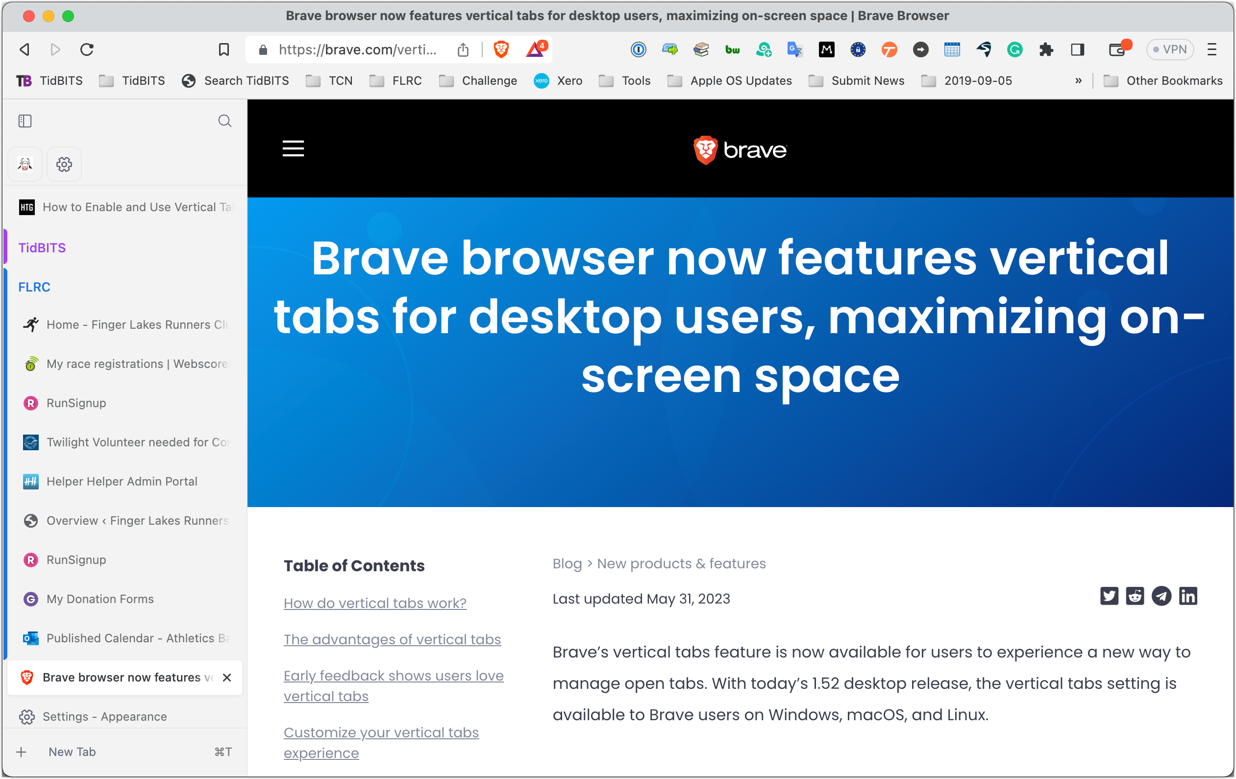
It’s easy to create tab groups by selecting multiple tabs, Control-clicking them, and choosing Add Tabs to Group > New Group. To populate my tab groups, I Command-clicked my bookmark folders for TidBITS and FLRC to open all their tabs simultaneously, then combined them into tab groups.
Unfortunately, pinning tabs in Brave causes them to jump to the top of the vertical tab sidebar and display as tiny unnamed icons, rendering the feature useless for multiple pages on the same site. Without better pinning, if you navigate within a standard tab in one of Brave’s tab groups, the only way of reverting to the tab’s original URL is by navigating back within it. Brave does remember the tab’s history, even through restarts, but it’s still clumsy.
Although Brave’s implementation of vertical tabs doesn’t make me want to switch back from Arc, I prefer it to the old top-mounted tab bar and plan to keep it active.
Firefox
Mozilla hasn’t yet seen fit to support vertical tabs within Firefox, but the Vertical Tabs Reloaded add-on gets you part of the way there. It doesn’t replace Firefox’s top-mounted tab bar (and there’s no way I can find to turn that off), so you’ll have to put up with that duplication. Aside from that, Vertical Tabs Reloaded does a decent job of providing a sidebar of your current tabs.
Although Firefox supports pinned tabs, both it and Vertical Tabs Reloaded lack the concept of tab groups, so there’s no way to organize your tabs in the sidebar. Like other browsers, pinned tabs appear only as tiny icons at the top of the sidebar in Vertical Tabs Reloaded, rendering even a manual organization of tabs somewhat pointless.
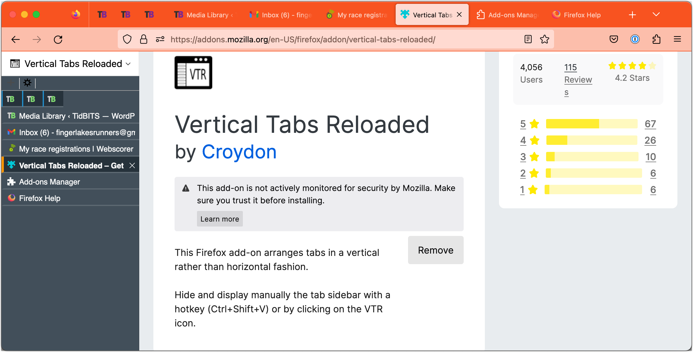
While Vertical Tabs Reloaded doesn’t come close to replicating the capabilities of Arc, it was worth leaving active in Firefox for my minimal testing and troubleshooting activities.
Google Chrome
I’m surprised that Google hasn’t added vertical tabs to Chrome yet, given that Brave and Microsoft Edge—both based on Chrome—have. Nevertheless, the only way to get vertical tabs in Chrome is with an extension like Vertical Tabs. As with the Vertical Tabs Reloaded add-on for Firefox, Vertical Tabs provides an additional sidebar containing tabs along with the usual top-mounted tab bar, which can’t easily be hidden.
Vertical Tabs doesn’t acknowledge Chrome’s tabbed groups, and while it does support pinned tabs, Chrome separates all pinned tabs from their tab groups on the left side of the tab bar, and Vertical Tabs mimics that by placing them at the top of its sidebar.
Making it even fussier to use, Vertical Tabs doesn’t display its sidebar when you open a new tab, and it takes a second to appear after loading whatever page is in that tab, causing content to slide right. Plus, as you can see with the TidBITS site below, which should be centered in the window, Vertical Tabs sometimes confuses sites as to the page width.
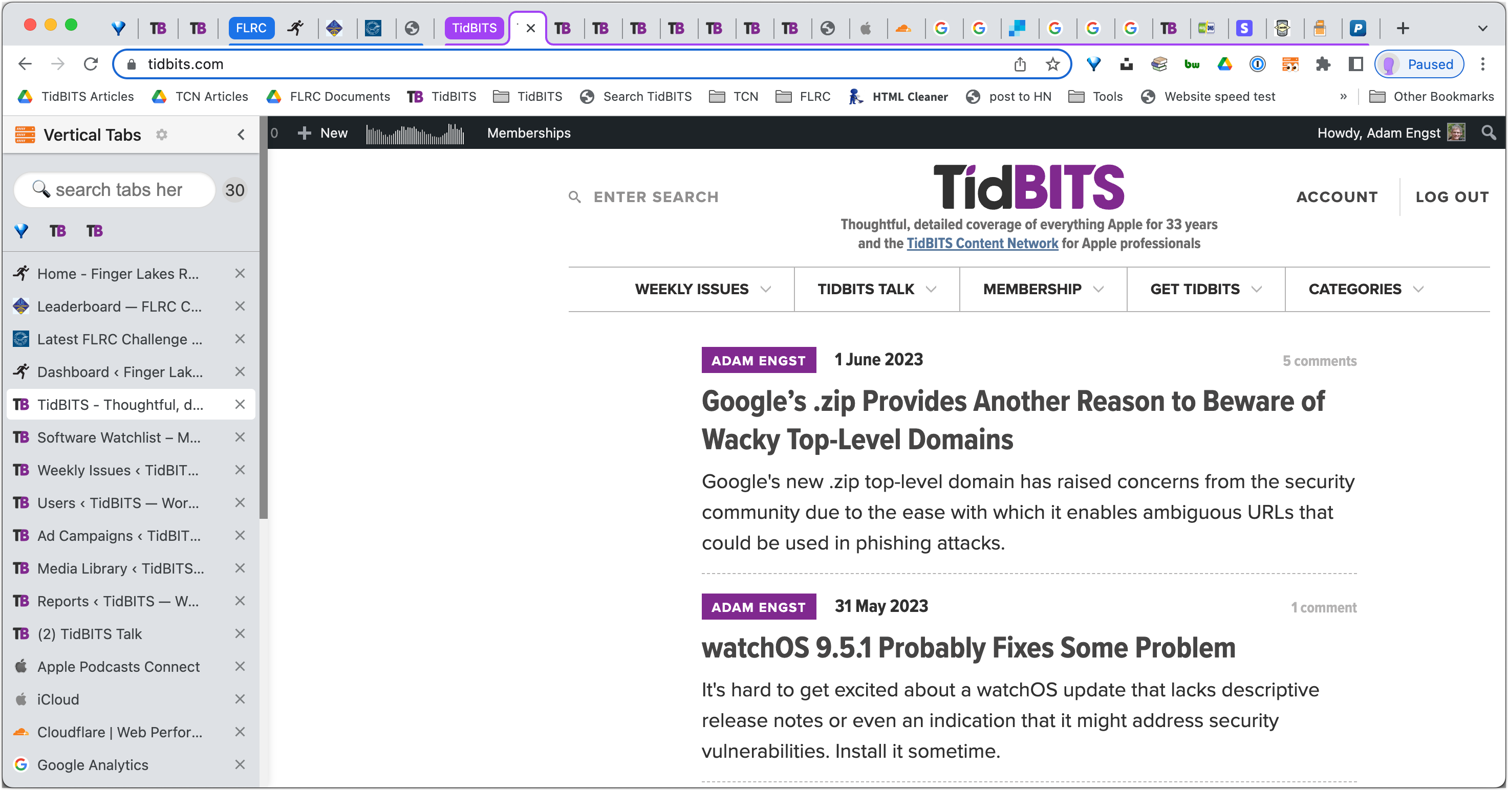
As with previous times I’ve tested it (or extensions like it), I found Vertical Tabs more trouble than it was worth and turned it off after capturing this screenshot.
Microsoft Edge
The vertical tab implementation in Microsoft Edge is similar to Brave’s from a functionality standpoint. You turn it on by navigating to edge://settings/appearance and clicking the Turn On button next to “Show vertical tabs for all current browser windows.” That’s an odd interface decision; why not use a toggle switch like the controls above it?
Edge does a slightly better job than Brave in visually connecting the contents of tab groups in the sidebar, but it has the same problem with pinned tabs moving from their group to the top of the sidebar.
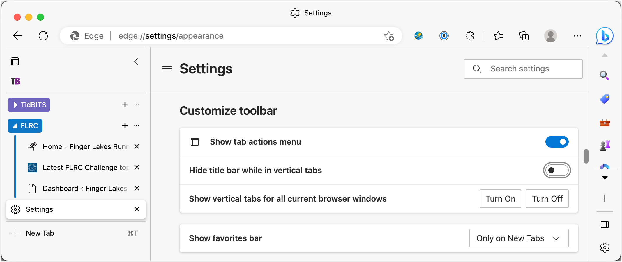
As with Brave, I’m not tempted to use Edge as my default browser, but I’ll stick with its vertical tab approach whenever I use it.
Opera
I haven’t used Opera in years, and while it continues in active development, even getting it set up enough to take a screenshot felt awkward. That quick impression aside, there is a Vertical Tabs extension available for Opera, and although it hasn’t been updated for over 4 years, it still seems to work.
It’s not particularly easy to set up, but once you install it and activate it from Opera’s sidebar (something that’s also not obvious), it does a decent job of letting you create, group, and access tabs. Although it supports pinned tabs, they’re removed from their groups and displayed as tiny icons like in many other browsers. Be sure to click the pin icon in the upper-right corner of the Vertical Tabs interface to keep it onscreen.
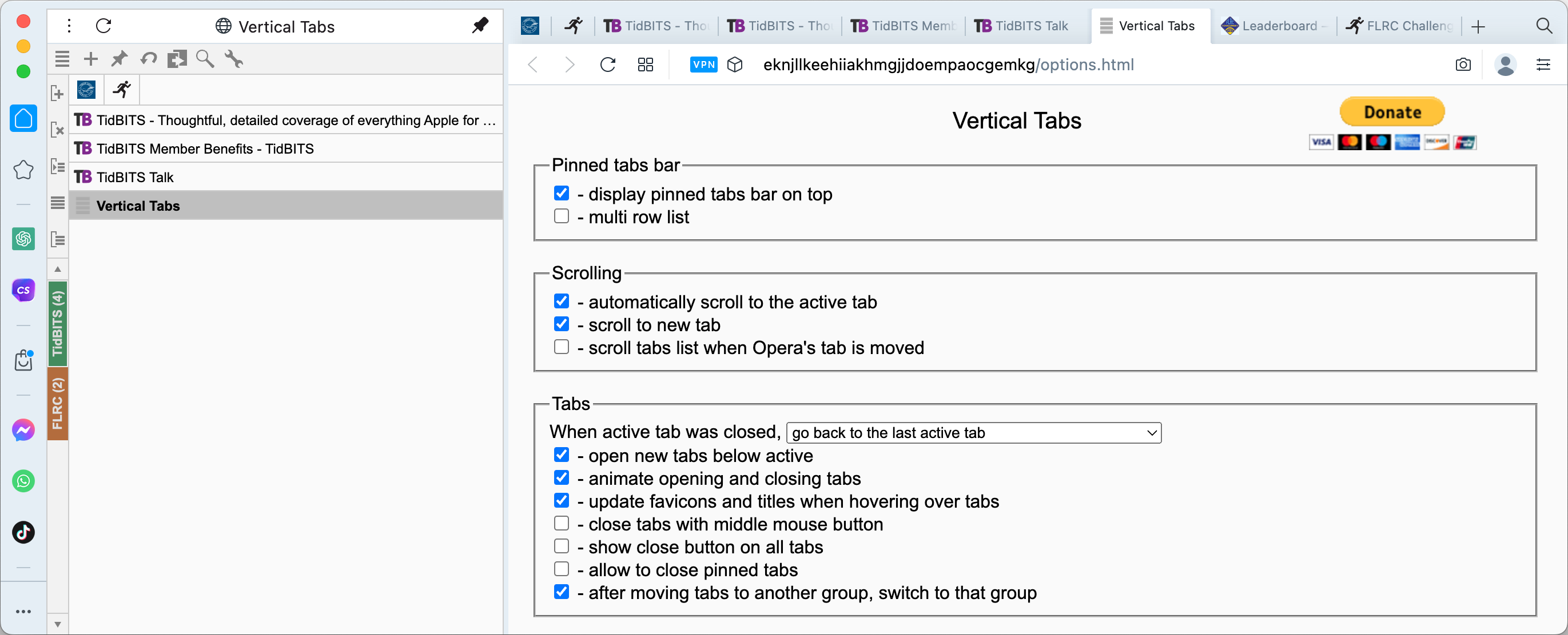
If you’re already a diehard Opera user, the Vertical Tabs extension is a boon, but it’s no reason to switch to Opera from any other browser.
Orion
I hadn’t been aware of the beta of the new Orion browser until Kagi, the company behind it, contacted me after my Arc review. (And yes, this Kagi is an entirely different company from the Kagi digital commerce company of yesteryear; the new Kagi purchased the kagi.com domain from the old one. See “Kagi Shuts Down After Falling Prey to Fraud,” 4 August 2016.)
Orion is extremely interesting. It’s built on top of WebKit, like Safari, but it also supports both Chrome and Firefox extensions, albeit with some caveats at the moment. The developers have put significant effort into making it fast and lightweight, and it boasts an impressive set of privacy options, with built-in ad and tracker blocking.
For this article, however, I want to focus on Orion’s vertical, tree-style tabs, which you can turn on by choosing View > Show Vertical Tabs Sidebar. What sets Orion apart is that it’s the first browser I’ve discussed so far that separates its tab groups—which it calls Named Windows—from one another. A pop-up menu at the top of the sidebar lets you switch between named windows, and Orion remembers their contents between restarts. Separating named windows in this way also makes pinned tabs more useful. Yes, they still appear at the top of the sidebar as nothing more than a tiny icon, but at least they’re specific to their named window rather than being all lumped together.
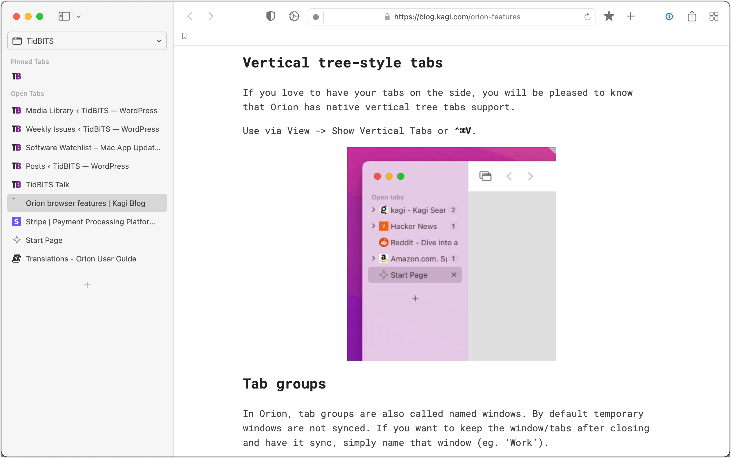
Orion even has a visual tab switcher like Arc, although its beta status was confirmed when I hit a bug that prevented the tab switcher from appearing when I moved Orion to another screen. Still, if you’re intrigued by independent Web browsers, Orion is worth a close look.
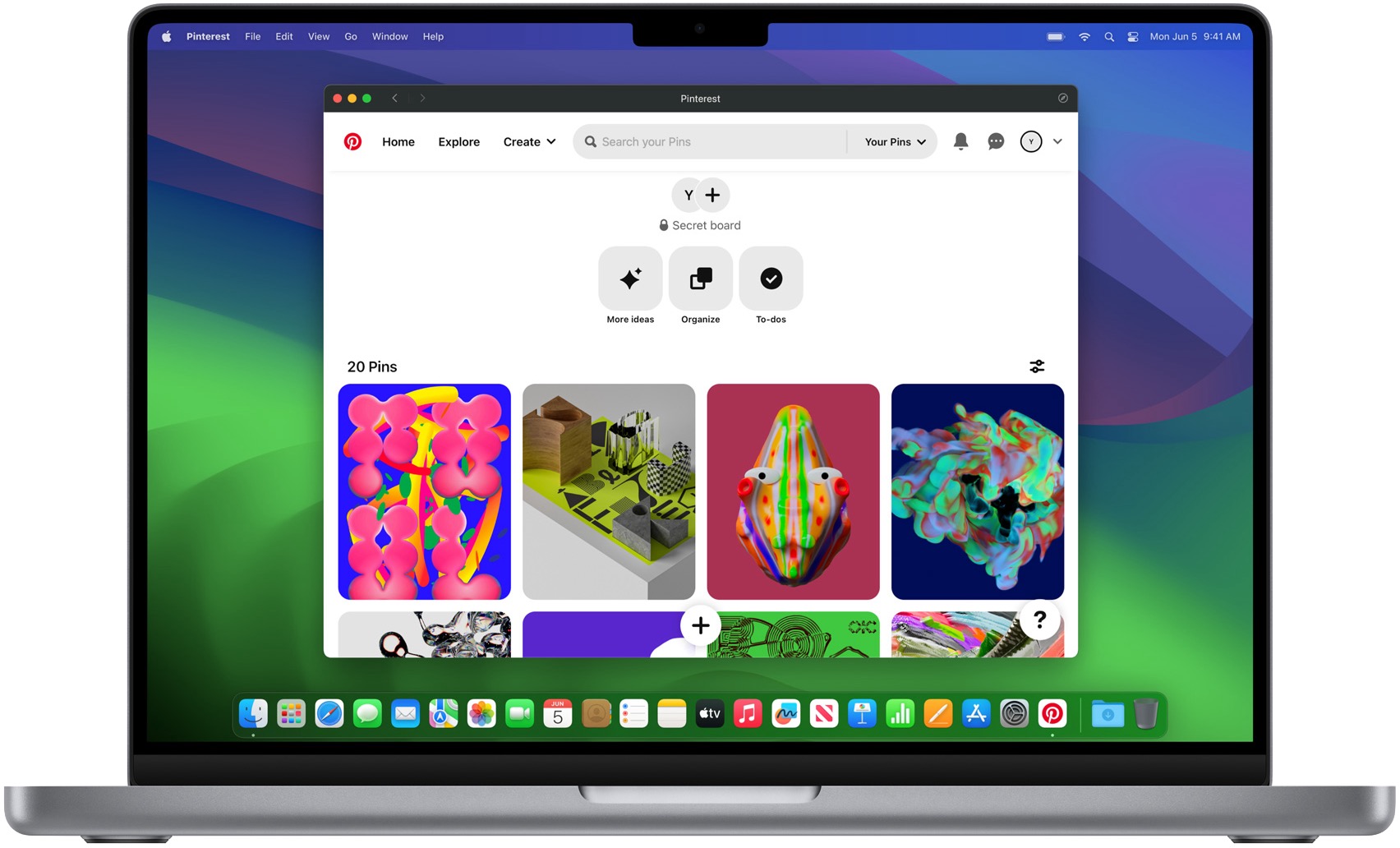
Safari
Safari needs no introduction, but you may not be aware that it has the most complete vertical tab implementation of any of the major browsers. You won’t find the term used anywhere in its interface or Apple’s documentation, but when you reveal Safari’s sidebar, you’ll see that tabs and tab groups appear there. (Part of the confusion is that the sidebar can also show bookmarks, your reading list, Shared with You links, and iCloud Tabs.) You may have to do a little clicking around to get your tabs groups to look how you want, but the capabilities are solid once you do.
When you’re in a tab group, creating a new tab puts it in the same tab group, and if it’s a page you want to revisit regularly, you can Control-click it and choose Pin Tab. Pinned tabs display a pin icon to the right of their names—thank goodness they don’t shrink to tiny icons!—and they’re sticky. Closing the window associated with a pinned tab displays Safari’s Start page, so you can’t accidentally close them. Control-clicking and choosing Unpin Tab lets you close it, or you can choose Close Tab to unpin and remove it in one step. To rearrange your pinned tabs in an order that makes sense to you, drag them around. Alas, you can’t rename them. Happily, you can turn off the top-mounted tab bar by choosing View > Always Show Tab Bar.
If you’re using Safari now, as I’m sure many of you are, I strongly encourage you to give vertical tabs a try and make liberal use of pinned tabs in tab groups. Apple did an excellent job with Safari, and if nothing else, its vertical tab support might encourage you to experiment with one of the newer browsers that has support for workspaces and additional interface refinements.
SigmaOS
Like Arc (and Vivaldi, as you’ll see next), SigmaOS is a radical rethinking of the Web browser interface, including a switch to vertical tabs collected into proper workspaces. I haven’t used it enough for a serious critique, but I found it quite challenging to wrap my head around and generally funky. For instance, you “mark tabs as done” with D instead of closing them with Command-W, and the File and View menus contain only a single command each (Print and Enter Full Screen). SigmaOS is just odd, but at least you can customize the keyboard shortcuts to bring Command-W back into play.
But, as I said, SigmaOS does let you create workspaces containing related tabs, and you can “lock” any tab to do what seems to be the equivalent of pinning it. You can drag tabs around in the list to arrange them in your desired order, although you can’t rename them, like in Arc, so the list is always a bit hard to read. SigmaOS also supports split-screen views, can open external links in standalone windows, and can sync the contents of workspaces between Macs.

As with Arc and Vivaldi, becoming familiar with SigmaOS would take at least a few days, during which you’d need to create and populate workspaces, configure keyboard shortcuts, and more. If neither of the other two fits with how your brain works, give SigmaOS a try.
Vivaldi
I’m embarrassed that I haven’t checked out Vivaldi before. It’s a mind-bendingly flexible Web browser that’s easily on par with Arc’s capabilities. Like Arc, it supports proper workspaces and displays tabs in a vertical sidebar, though you can also put them on the top, bottom, or right. You can pin as many tabs as you want, and they display like standard tabs rather than shrinking to useless little icons. It has a visual tab switcher and can sync your setup between devices.
As impressive as Vivaldi’s feature set is, it lacks Arc’s attention to interface detail. For instance, the sidebar picks up its color from the current site, so it’s purple in the screenshot below because it’s showing the TidBITS site. But when you move to any other site, the entire sidebar changes color, which is visually abrupt. You can switch to a Subtle theme that makes the sidebar gray for all sites, which is less glaring but still doesn’t compare to Arc’s clever approach of colorizing the sidebar differently for each workspace.
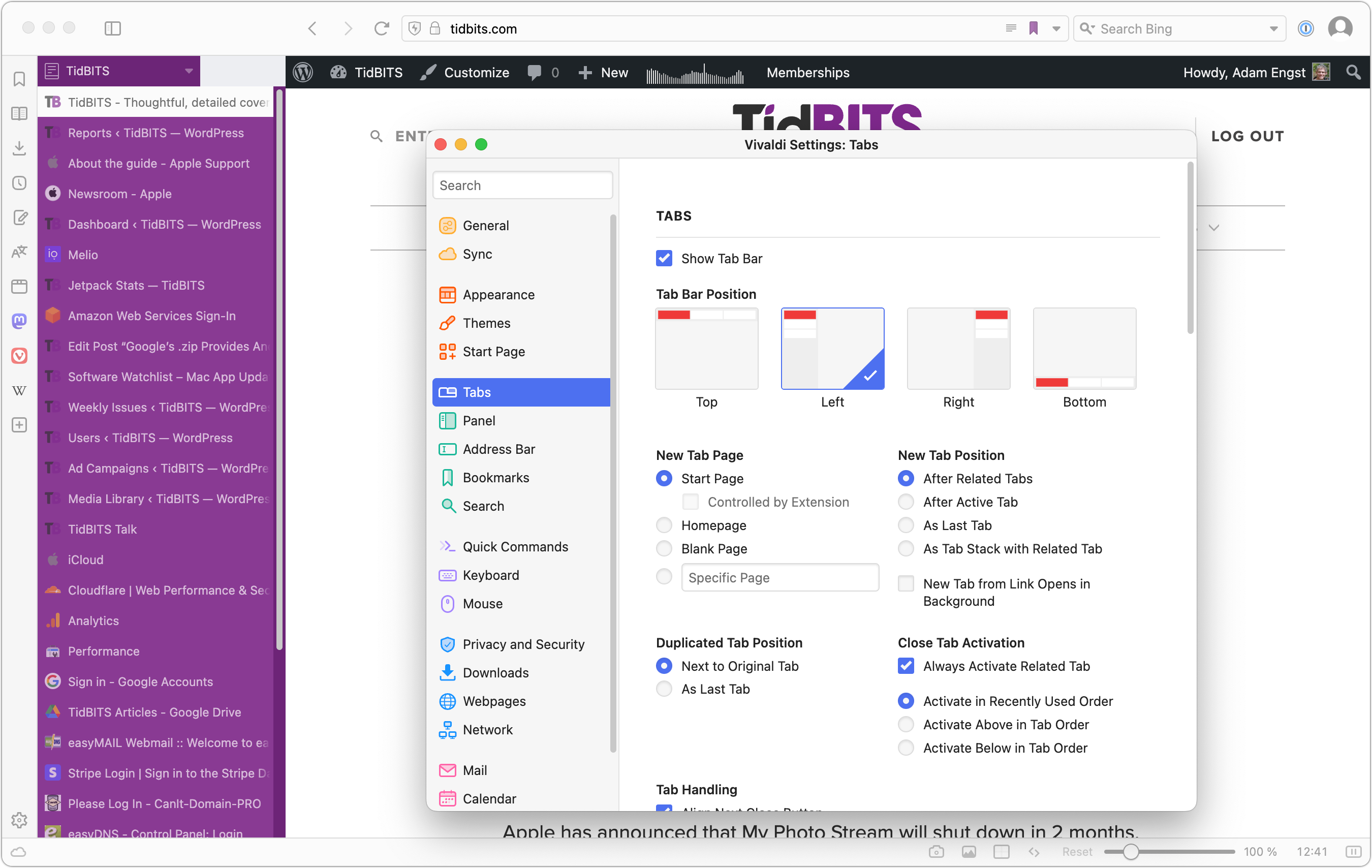
Similarly, although you can move pinned tabs within Vivaldi’s sidebar, you have to do it by Control-clicking and choosing Move Tab > Up/Down rather than just dragging. Nor can you drag a regular tab up into the pinned tab area to pin it; you must Control-click it, choose Pin Tab, and then move it. Configuring Vivaldi as you like would be tedious, and there’s no way to rename tabs, as in Arc, so you’re at the mercy of however the pages were named.
Nonetheless, If I weren’t already delighted with Arc, I would seriously consider a switch to Vivaldi right now—it’s that much better than the major browsers but doesn’t venture as far afield as SigmaOS.
In the end, those who seldom open lots of tabs and don’t spend hours per day in a Web browser may see vertical tabs as a distinction without a difference. But if you rely heavily on your browser—particularly if you prefer tabs to be represented by their names rather than just icons—I encourage you to experiment with the vertical tab options now available.