#1497: Apple Watch Series 5 impressions, why is Apple TV advertising at us?, CES 2020 gadgets and services
Have you been contemplating upgrading from an older Apple Watch? Adam Engst moved from an Apple Watch Series 2 to a Series 5 last year, and now he shares his impressions of what changes made the most difference in regular use. For those with an Apple TV, have you been perturbed by the non-stop advertising in the Apple TV app? Josh Centers has, especially when it’s inappropriate for kids, but he has a way you can remove some of the ads. Finally, Jeff Porten gives new meaning to the term “roving reporter” in traveling straight from CES in Las Vegas to a conference in Italy, but you can now read his first article describing gadgets and services unveiled at the show. Notable Mac app releases this week include ChronoSync 4.9.8 and ChronoAgent 1.9.6, Microsoft Office for Mac 16.33, BBEdit 13.0.4, TextExpander 6.5.3, Alfred 4.0.8, and Quicken 2019 5.14.
Upgrading from an Apple Watch Series 2 to a Series 5
When Apple announced the Apple Watch Series 5 back in September (see “Apple Watch Series 5 Introduces Always-On Display,” 10 September 2019), I initially categorized it as I had the previous several Apple Watch releases: undoubtedly better than my Apple Watch Series 2 but not worth buying for myself.
Several weeks later, however, I realized that I had become increasingly disenchanted with the performance of the Series 2 and decided to treat myself to a new Series 5. Then I could hand the Series 2 down to my son Tristan, and my mother could try his original Apple Watch to see if she liked it. (Up to this point, Tonya had the newest model in the family, a cellular-capable Series 3.)
I’ve now had several months with the Apple Watch Series 5, and I wanted to share my impressions about what makes a difference and what doesn’t. I’m sure not everyone will agree with my conclusions, but if you’ve been holding onto an older Apple Watch, you may find my thoughts useful in determining whether or not to upgrade.
Always-On Display
First off, let’s dispense with the elephant in the room: the much-ballyhooed Always-On Retina display. It’s a fine screen, and nice to look at, but the always-on aspect of it is, if not worthless, certainly not worth much. In essence, Apple is employing some clever engineering and user-interface trickery to enable the display to continue showing something even when you’re not looking at it, all while maintaining good battery life. (Speaking of which, battery life wasn’t a problem on my Series 2 despite its age.)
The Always-On Retina display works—there’s always something showing on the screen—but it doesn’t do what Apple implies. When you lift your wrist, you see the screen brighten and various bits update from their previously dormant state. I’m not sure that’s any less annoying than waiting a beat for the screen to light up, as was necessary for all previous models.
Worse, if you’re using an app—I often use the Strava app to record workouts—the screen doesn’t show the app, just the time, until you raise your wrist and look at it. I suppose that’s better than nothing, but if I’m using the app, I want to see the app, and waiting for the screen to brighten and the time screen to be replaced by the Strava screen isn’t notably better than having the screen be entirely dark when you’re not looking at it.
Don’t buy an Apple Watch Series 5 because of the Always-On Retina display.
Similarly, I’ve found no benefit to the new built-in compass in the Series 5, or its international emergency calling. That’s me—if you regularly care about what direction you’re facing or worry about reaching emergency services on regular international trips, these features may be important to you.
Bigger Screen
So let’s talk about what does make a difference. The first thing I noticed when I got the Apple Watch Series 5 is that its screen is bigger: 40mm (324-by-394 pixels) on the smaller model that’s the right size for my wrist, compared to the Series 2’s 38mm (272-by-340 pixels). You wouldn’t think that 2mm of diagonal screen size would be a big deal, but all those extra pixels made a real difference.
Until the last month, I was struggling with a slightly out-of-date contact lens prescription that didn’t work well at wrist distance, meaning I could barely read the watch without reading glasses. The larger screen was noticeably easier to read. If you’ve been frustrated by the size of text on the Apple Watch screen, upgrading to a Series 5 (the Series 4 is no longer available, and the Series 3 has the smaller screen) may be a win for you.
Faster Performance
It’s impossible to compare the performance of the Apple Watch Series 2 at its 2016 launch to how it was working in 2019 with watchOS 5 and then watchOS 6, not just because of the evolution of watchOS but because of newer apps and an older battery. The main non-Apple app I wanted to use was Strava, and it was dog slow on the Series 2. (Where the dog in question is old and lame; it’s not clear why dogs get a bad rap for speed in that cliché.) It felt like the entire interface was submerged in molasses—I’d tap a button and wait so many seconds for it to depress that I never quite knew if I’d actually tapped it or not.
In contrast, the Apple Watch Series 5 has been a joy to use. It’s not the most responsive user interface ever, but it’s fine for what I do. Meanwhile, when Tristan replaced his original Apple Watch with the Series 2, he was impressed at how much faster it was, and my mother hasn’t commented on the performance of the original model that she’s using now, although she’s not using any apps. It’s all what you’re accustomed to.
I had wondered if the Series 5’s improved performance would encourage me to use more apps—had I been shying away from playing with apps because I knew the performance would be dreadful? The answer turns out to be no—Strava remains the only non-Apple app I use, and of the built-in apps, I still rely only on complications, Siri, and the Timer app.
Bands and Colors
I wasn’t a huge fan of the silicone Sport Band that came with my original Apple Watch, although Tonya likes hers. Nor did I like the woven nylon buckle band that came with my Series 2. So when Tonya bought her Series 3, we got a Seashell Sport Loop with it, and I took that over. My problem with the Sport Band was that the holes were never quite in the right spot for me, so it was sometimes a little too tight and other times a little too loose. The Sport Loop, in contrast, is brilliant because you can adjust it to whatever size your wrist is (or feels like it wants) at the moment.
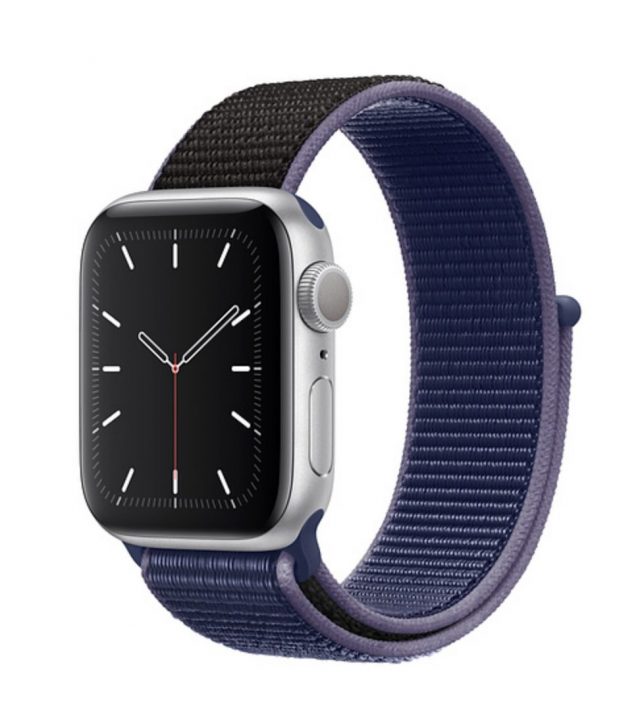 Every year, Apple announces new colors for its Apple Watch bands. I’ve liked some of them in the past, but at $49, I could never justify the expense of replacing the grayish Sport Loop. I was looking forward to picking out a new color for the Sport Loop, but I was disappointed to discover that every time Apple comes out with new colors, the company drops all the old ones. In my fashion cluelessness, I had assumed the others would remain available. In the end, I was pretty happy with the Midnight Blue Sport Loop, but I remember liking other previous colors more. C’est la vie!
(If I ever get around to it, I’ll try the cheap knock-off Sport Loop replacements available from various Chinese companies on Amazon, like this five-pack for $24.)
New Watch Faces
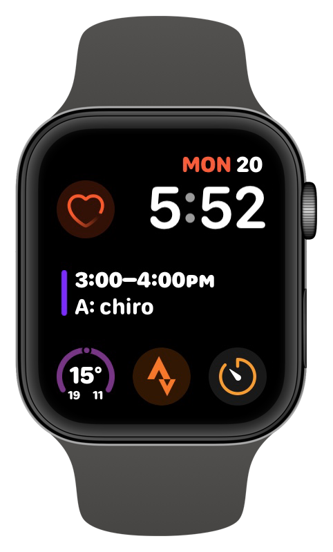 Apple adds new watch faces with each new version of watchOS and each new Apple Watch release, it seems, and not all are available on older models. I was looking forward to exploring the new watchOS 6 faces that weren’t available on my Series 2, such as Gradient, Infograph, Infograph Modular, Meridian, and more. Apple has a full list of every watch face, its customizable features, and its available complications.
Most of these watch faces seem merely like eye candy—I’m uninterested in an analog dial of any sort—but the Infograph Modular face provides an alternative to the Modular face I had been using without losing any functionality.
Your mileage is likely to vary here since the choice of watch faces seems like the veritable definition of personal preference.
Was It Worth It?
Spending $499 to upgrade from the Series 2 to the Series 5 was worth it for me, especially given that I’m in the business of keeping up with Apple. I opted to get the GPS+Cellular model not because I intended to use it but because Tonya will likely take over this Apple Watch at some point, and she does need cellular connectivity because she often doesn’t have her iPhone 7 handy due to it being too large to carry comfortably on her body. Plus, if something changes with a future version of watchOS or an app that makes cellular connectivity attractive, I’ll be able to sign up for it without buying new hardware.
In the end, I would suggest that it’s probably worth upgrading to a Series 5 from an original Apple Watch, particularly given its aging battery, or a Series 1. The improved performance and longer battery life will likely be welcome. It’s harder for me to say that the Series 5 is so much better than the Series 2 that it’s worth even $399 to upgrade to the GPS-only version of the Series 5. Similarly, you will notice the larger screen and improved performance if you’re moving from a Series 3, but just as with an upgrade from a Series 2, is it worth $400 to $500? Finally, unless you have money burning a hole in your pocket, I can’t see much reason to upgrade from a Series 4 to a Series 5.
Why Is the Apple TV Constantly Advertising at Us?
The Apple TV app on the Apple TV is currently the bane of my existence. In theory, it should be a tidy way to manage everything you watch, bringing together content from Apple, Disney+, HBO, Hulu, and other streaming services (but still not Netflix, for some reason), plus live news and even sports. It sort of does that, but over time, Apple has started using the app to push the company’s own paid content, especially its Apple TV+ service. Open the Apple TV app and it inundates you with ads for Apple TV+ and its shows. Frankly, this bugs the heck out of me, especially since many of the ads are inappropriate for my kid to see. Before I succumb to the need to rant, here’s a tweak to make the Apple TV app a little more tolerable.
Replace “What to Watch” Ads with “Up Next” in the Top Shelf
If you use a fourth-generation Apple TV HD or Apple TV 4K, you’re probably familiar with the Top Shelf feature, even if you didn’t know what it was called. Top Shelf is what appears at the top of the screen when you select one of the icons in the top row of the tvOS Home screen. It’s usually a promotion for whatever the selected app offers.
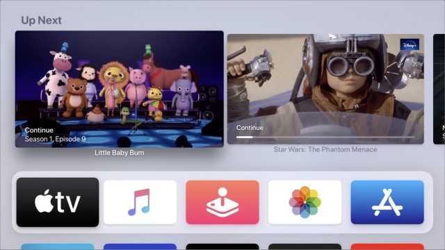
Prior to tvOS 13, if you placed the Apple TV app in the top row and selected it, it would display items from your Up Next queue, and you could swipe up and then left or right to select one and play it directly from the Home screen. Useful! But in tvOS 13, the default is to display autoplay videos of whatever Apple feels like promoting. Not useful! (See “#DeathToAutoPlay—No More Audio and Video That Plays Automatically!,” 6 February 2019.)
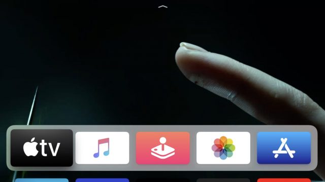
Apple may be pushing its own service and shows in the Apple TV’s Top Shelf preview area, but at least the company has given us an out. Simply go to Settings > Apps > TV and select Top Shelf to switch it from What to Watch to Up Next. Seeing your Up Next queue in the Top Shelf area is much more useful since it lets you quickly pick up where you left off watching something.
Insert Rant about Apple TV Advertising Here
I roasted Amazon for this sort of pushy commercial behavior back when I reviewed the original Fire TV in “Fire Watch with Me: Amazon Fire TV vs. Apple TV” (13 May 2014):
While Movies, TV Shows, and Music are fixed icons that you can’t ignore on the Apple TV, Amazon takes the Fire TV’s interface to a whole new level of “Buy from me!” You literally cannot get to Netflix, Hulu, or any games without crossing the Amazon river of content, though there is a Recent section under Home that shows recently opened apps and videos. The Fire TV makes no bones about being a vehicle to push Amazon’s digital content.
With the Apple TV app, Apple has copied Amazon’s strategy almost verbatim. Besides the somewhat-useful Up Next feature, almost everything on the home screen of the Apple TV app is geared toward getting you to give more money to Apple. Since I’m spending a bunch of time with the Apple TV while updating Take Control of Apple TV, I have some thoughts about all of this.
Just under Up Next (which lists things I actually watch or may want to watch) is a section called What to Watch. Listed there—at least for me—are The Bachelor (never seen it, couldn’t care less), The Mandalorian (already finished it), Ellen’s Game of Games (couldn’t care less), and so on. Each of these items is either trying to get me to watch content in which I have zero interest or re-watch something I’ve seen before. There’s no way to customize this list so that it’s helpful to me. Why isn’t the Apple TV app working for me, rather than for Apple?
Even more annoying is that the Apple TV app regularly advertises content that is wildly inappropriate for my children. I realize that statement risks branding me as a prude, but the app is supposed to be the primary interface for content on the Apple TV and should be appropriate for all ages.
For instance, just below What to Watch is a banner for Apple TV+ that advertises children’s shows like Helpsters and Snoopy in Space alongside the Jason Mamoa vehicle See, a show so pornographic that it even leaves hard-nosed critics baffled. (You may not want to click that link at work.)
I’m not here to play Church Lady; I’m just saying I’d like some control over what the Apple TV app shows. For instance, to get to the news section of the Apple TV app, I had to scroll through ads for:
- The Morning Show, the Apple TV+ original that has more f-bombs than a Quentin Tarantino movie
- Fleabag, the opening scene of which has the protagonist gratifying herself to a Barack Obama speech
- Joker, a film about a mentally ill man who becomes a murderous clown
Joker might be the most egregious, since you have to pass somewhat disturbing still images of Joaquin Phoenix turning himself into the Joker. In an odd nod to parentally prudish types such as myself, Apple edited the cigarette out of his hand, which may bother me even more. Why not just pick a different scene or just not show stills from the movie? Joker made over a billion dollars on a $50 million budget and was one of the most talked-about films of 2019. I don’t think it needs such a heavy-handed promotion.
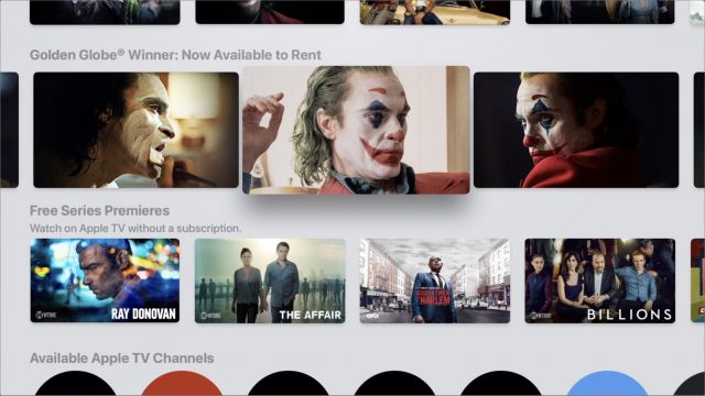
Again, I’m not here to knock the Joker movie (my wife and I enjoyed it) or your taste in entertainment. I’d like to either be able to hide explicit content in the Apple TV app or at least have the option to move things like News above all the ads. If you live in a childless household, you’ll get pretty tired of having to scroll through ads for Little Baby Bum to get to HBO.
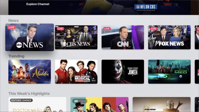
Even if you don’t have kids and don’t object to adult content, being able to rearrange things in the Apple TV app would make it easier to navigate. For instance, scrolling down the Watch Now screen, I come across three rows highlighting content from five seemingly random services: Apple TV+, Disney+, HBO GO, STARZ, and PBS Video. I have subscribed to all of them at some point, but I’m currently interested in only Disney+. Why can’t we move the services we want near the top of the screen and hide the others?
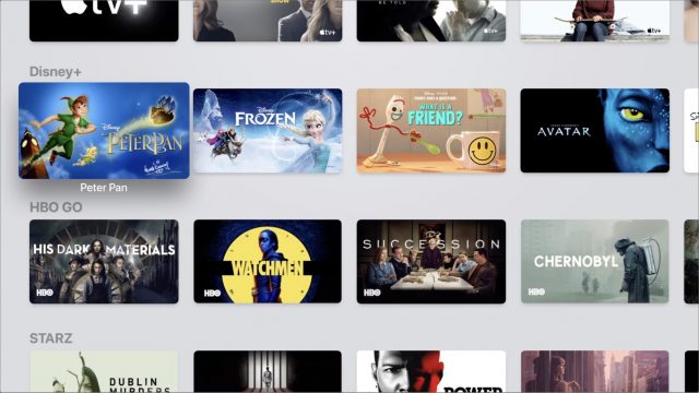
Apple gives you a small amount of control over only one section in the entire Apple TV app. That’s Up Next, which keeps track of shows and movies to finish and recently purchased items. You can press and hold a title in Up Next to see options to remove it from your queue.
 And if I set restrictions for movies and TV shows in Settings > General > Restrictions, Up Next stops suggesting the content that I’ve restricted. So if your rating limit is PG-13, R-rated movies don’t show up in your Up Next queue. Up Next is the only part of the Apple TV app that caters to your interests. But with tvOS 13 and Up Next being removed from Top Shelf by default, Apple seems to be trying to wriggle even that level of control away from us.
Thankfully, the Apple TV app is entirely optional on the Apple TV unless you want to watch any of the AppleTV+ originals. To return to the Home screen at any time, simply press and hold the Menu button. You can also set the Home button on the remote to go to the Home screen instead of the Apple TV app—see “TipBITS: Make the Apple TV’s Home Button Go Home” (14 June 2019).
It’s unfortunate, though, that Apple hasn’t designed the Apple TV app to be actively helpful to the user. Instead, Apple has decided to make it a promotional vehicle to shove the content the company wants you to watch down your throat. There are third-party alternatives—see “Avoid Netflix AutoPlay Previews on the Apple TV with Reelgood and WatchAid” (9 August 2019)—but it’s a shame we have to look elsewhere for apps that are working for us.
After all, an Apple TV costs between $149 and $199. At that price—much higher than most of the competition—is it too much to ask that we not be inundated with advertising? Anyone who spends that much on an Apple TV will probably be interested in Apple TV+ without an overbearing sales pitch, and turning such an expensive device into a billboard makes it feel cheap, like a Fire TV. Apple has always prided itself on its good taste, and turning the Apple TV’s front end into an ad platform is anything but.
How about you? If you use an Apple TV, do you use the TV app, or do you prefer to start your viewing in some other way? Register your vote in our quick single-question survey and tell us why in the comments.
CES 2020: Flying Cars, Smart Pillows, and Virtual Dog Fences
If you’re a regular reader of my coverage of CES, you might have noted a trend: my first story opens with some variation on “welcome to the annual trade show for consumer electronics,” while I try to open every other story with some anecdote emphasizing the size or strangeness of what’s on display.
This year is different, as I’m writing this story en route from Milan to Verona—the cities in Italy, not two new hotels on the Las Vegas Strip. (Considering that the Strip features a Venetian, Paris, and New York, it’s easy to get confused.) I had conflicting conferences this year, so my CES trip was abbreviated: long enough to see plenty, but nowhere near enough time to see everything. This travel schedule is also why my coverage this year has been unfortunately delayed.
The simple solution: if a gizmo, gadget, or announcement took place only on the floor in the Las Vegas Convention Center, I missed it. This year’s coverage covers events at the three breakout shows (CES Unveiled, PEPCOM Digital Experience, and ShowStoppers) and booths at the Venetian: the Sands Expo and Eureka Park. These spaces regularly have the biggest bang for the buck regarding footsteps per day converting to things worth writing about—but for a CES completist like myself, I regret losing some of the serendipity that comes from wandering. More to the point, don’t read a negative appraisal into something you might have read about elsewhere that’s omitted here. It’s never possible to see everything, but this year more than most, most of the exclusions are due to geography.
Aeronext Flying Gondola
Flying cars are expected to become reality sooner than we’re likely to be ready for them (see “CES 2020: Tech Trends to Watch,” 7 January 2020), and while I have no idea if Aeronext will be part of that, I have to admit its design is nifty. The proposed Flying Gondola is a quad-rotor vertical takeoff and landing (VTOL) vehicle with an enclosed cab that carries people. (In its first year of production, likely brave people.) Right now Aeronext has a one-third scale model of its interim product, a Gondola (more of a bathysphere) that carries only a single person. My bet for the first successful product in this arena is whichever one partners with Uber or Lyft and makes flying a rideshare; Aeronext is probably better set up to do that in Japan rather than the United States. I’m mentioning Aeronext because of the design, but also because its branding is in keeping with this year’s Italian theme, and the video of the model at the link is nice, but this illustration is wonderfully insane.
AirSelfie Air Pix+ Compact Drone
I was a fan of the AirSelfie drone the first time I saw one (see “CE Week 2018: New Tech at “CES East”,” 29 June 2018). It’s a drone-based camera the size of a deck of cards, suitable for carrying in a pants pocket until aerial photography is of interest. The company has announced two upgrades, both due later this year. The Air Pix+ takes 12-megapixel photos or 1080p video, but only briefly: it has only 8 GB of onboard memory and flight time is 6 minutes. The Air Duo is made out of aluminum (rather than durable plastic) and will have both front and bottom-facing cameras, with an extra minute of flight time and 16 GB of memory. No pricing was announced, but the original Air Pix debuted at $199 and now costs $99.95. An optional Powerbank carrying case includes a 3500 mA battery and automatically recharges for the next flight, it’s $39.
CarePredict Tempo Series Senior Monitor
I’ve seen any number of belts, shoes, and bracelets designed to detect when an elderly person has fallen and can’t get up, but the CarePredict @Home Tempo Series 3 goes much further than that. It’s a wrist-sized device that can be worn on an included band or in a pocket, and it comes with four beacons that are placed around a senior’s home. Aside from emergencies like fall detection, the Tempo tracks the wearer’s habits and alerts family or caregivers if there are changes that could indicate an underlying problem: fewer or more trips to the bathroom, a missed visit to the kitchen indicating a missed meal, or more time spent in bed. CarePredict claims that tracking and responding to these changes early can prevent falls, malnutrition, depression, and urinary tract infections. The company is researching other maladies that correlate to pattern changes and will roll out those monitoring services when it can demonstrate efficacy. But you’ll pay for this level of tech smarts: the Tempo costs $449 with a 45-day money-back guarantee and 30 days of service, which costs $69.99 a month afterward.
Life Is Tech’s Disney Codeillusion
Teaching kids how to code is a crowded field at CES. I’ve seen at least a dozen products and services designed to turn young children into master programmers for parents who aren’t already reading their kids bedtime stories in JavaScript. Life Is Tech’s approach to the market resembles genius: it has licensed a panoply of Disney characters and movie scenes for its Disney Codeillusion coursework, and for the first 1000 people who sign up, the ridiculously popular Frozen characters are the free trial. At the time of this writing, the trial is still open. It includes one of around 125 lessons from the full course, which teaches HTML, CSS, JavaScrlpt, and “processing” (whatever that might be). Each lesson takes approximately 30 minutes, so this is a rather deep dive into a long course of study, but given the trappings, many kids won’t think of it as work. The full course costs $1999 with a $65/month payment option.
IEVA Time-C Body and Environment Sensor
I nearly passed on the IEVA booth because its imagery and tagline, “the jewelry that takes care of you,” implied a certain kind of lifestyle brand that I skip. A closer look, however, revealed the Time-C, a smartwatch with an analog dial. Like its jewelry cousins, which seem to be varieties of pendants, the Time-C’s design hides a large number of sophisticated sensors that monitor you and your environment. In addition to the de rigeur heart rate and activity tracking, the sensors record skin temperature and calorie counts. It also picks up on indoor and outdoor pollution, UV index, luminosity level, ambient noise, and pollen counts. You view these readings on a companion iPhone app. When it comes out at the end of the first quarter, the Time-C will be finished in “vintage metal” and rose gold, and will retail for $490. The company’s pendants come in many varieties, but some have fewer sensors than the watch. My materials state they all tell the time, but I can’t discern where the screen is. Currently shipping pendants in the Twin-C and Twin-C to Go series range in price from €119.50 to €229.50; newly announced models coming in 2020 range from €149 to €278.
Jabra Elite Active 75t Wireless Earbuds
Jabra’s Elite 75t earbuds are ranked as the best wireless earbuds by my preferred review site, Wirecutter, and the company’s Elite Active 65t headphones take top marks for workout headphones. So you may understandably be interested in the impending release of the new Elite Active 75t. These earbuds are 80% the size of the Elite Active 65t and sport nearly double the battery life at 7.5 hours, with three more full charges in the case. They are waterproofed to IP57. They have noise isolation from the fit, but not active noise cancellation; a “HearThrough” mode lets ambient sound come through. They will be priced at $199, with various color options coming available between February and April 2020.
Jabra is also releasing two software updates in Q2 that will retroactively work with some headsets, although the company does not indicate how far back their compatibility will reach. Jabra MySound will work with an iPhone app to calibrate music frequencies to the individual hearing of the user, while Jabra MyControls will allow each earpiece to be used individually, effectively doubling the battery life outside of the case.
(This year’s CES had many examples of music earbuds with assistive hearing features, along with assistive hearing earbuds with music features. I’m hoping to do a comparative review later this year.)
Motion Pillow Snoring Aid
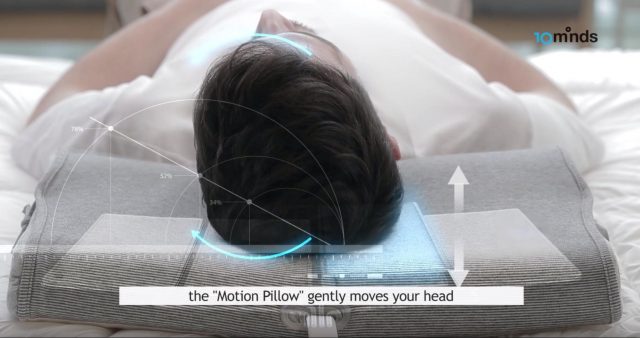
Snorers can tell you that many companies (and surgeons) promise to fix the problem, but no technique works for everyone, and many people have tried and failed with many products. The Motion Pillow might be another such product, but it looks promising. It looks like a standard ergonomic pillow, with foam curvatures, but attached to a plastic box of sensors. The sensors analyze the pattern of your snoring and come up with a unique pattern to apply to airbags in the pillow, which will gently rotate or move your head slightly to keep your nasal passages open. The Motion Pillow is slated to ship in May, and you can order it now on Indiegogo at an early bird price of €264, a 30% discount off of the retail €378.
MyFit Custom Earbud Covers
MyFit might be a cheaper solution for audiophiles who want a particular kind of headset, but need to find a different model because it doesn’t fit well in their ears (ahem AirPods cough). Hold an iPhone running a free app up to your ears and it will make a 3D scan of its contours. Then you send that scan and which headphones you use to MyFit Solutions, and 7–10 days later you’ll have two custom sets of silicone ear tips shipped from France. MyFit supports only a subset of headsets, though, and at an introductory price of €65, it’s not worth the expense for cheaper headsets.
OhSnap iPhone Grip
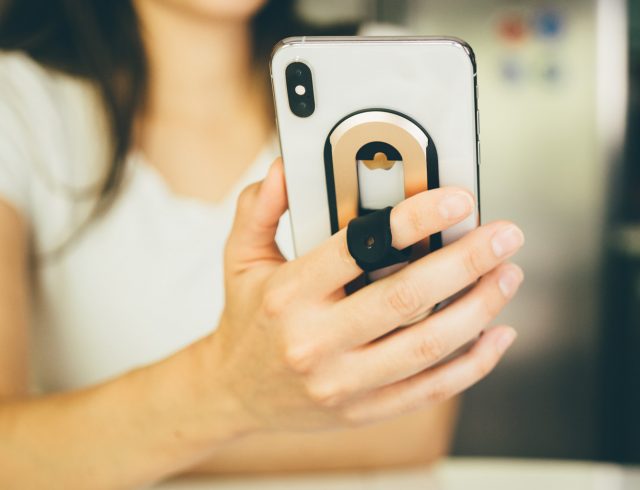
I can think of two times I’ve walked up to a CES booth and thought, “I need that right now.” The first was the PogoCam, a camera that attached to eyeglasses, which worked poorly in the real world (see “CES 2017: From Laundry to Play-Doh at Showstoppers,” 9 January 2017). The second is the OhSnap iPhone grip, which would have solved a problem I was having at that moment. The OhSnap is a fabric loop attached to a plate, which in turn attaches to an iPhone or case; put your finger in the loop for a secure grip on the phone. The genius part: the loop can slide up and down the plate or rotate, allowing the demonstrator to flip his phone around like a carver at Benihana. More to the point, it’s easy to make any part of the screen accessible for one-handed thumb access, and switching from portrait to landscape for photos is a cinch. Better yet, the plate can be attached to any magnetic holder, converts into a kickstand, and barely changes the thickness of the iPhone. Shipping now in nine colors for $29 direct from OhSnap.
SpotOn Virtual Dog Fence
CES is infamous for products of dubious effectiveness designed to help you communicate or take care of your pets, and frequently I’ll cover one as that article’s item of mockery. Not so the SpotOn virtual fence. It’s a dog collar with built-in GPS and cellular connectivity. Use an app on your phone to draw out the lines of a fence on a map, and that virtual fence suddenly exists for your dog. Included training programs give you the option of using “static correction” (apparently the military euphemism for “dog zapping”) when a boundary is passed, positive feedback (the app alerts you to your dog’s compliance and you give it a treat), or a mixed mode. Whichever training you use, the app also supports “Find My iDog,” whether Rover is inside the fence or on walkabout. The feature I liked best is that you can have up to ten virtual fences saved, so you can use a few at home and nearby parks, with several more that you set up on the fly when traveling with your pooch. At $1495 (plus $6.95/month for service after 60 days), SpotOn is not cheap, but I’m told it’s competitive with fixed-location virtual fencing.


