#1585: macOS 12 Monterey and iOS 15.1 released, 1Password secure password sharing, choosing the right chart in Numbers, Apple device updates in Software Update
macOS 12 Monterey is here, joined by the feature releases—think SharePlay and FaceTime screen sharing—of iOS 15.1, iPadOS 15.1, watchOS 8.1, tvOS 15.1, and HomePod Software 15.1. In other Apple update news, Adam Engst has confirmed that Apple is now distributing device compatibility updates through Software Update, so you don’t have to plug an iPhone or iPad into a Mac to trigger the necessary software download to communicate with it. Adam also takes 1Password 7.9’s new secure password sharing feature for a spin, comparing it to similar services. Finally, Take Control of Numbers author Sharon Zardetto joins us to explain when to use which chart in Numbers. Notable Mac app releases this week include Airfoil 5.10.5, Typinator 8.10, iMovie 10.3, GarageBand 10.4.4, Logic Pro 10.7, Parallels Desktop 17.1, BBEdit 14.0.2, Carbon Copy Cloner 6.0.4, Little Snitch 5.3.1, and Final Cut Pro 10.6, Compressor 4.6, and Motion 5.6.
Device Software Updates Now Appear in Software Update Too
One of the more mysterious aspects of using multiple Apple devices comes when you connect an iPhone, iPad, or iPod touch to a Mac and are greeted with a dialog from an app called MobileDeviceUpdater telling you, “A software update is required to connect to iPad.”
It’s responding to your device having a newer version of its operating system than the Mac recognizes, so it’s most likely to happen after you update your device. The Learn More button leads to an Apple support page, but it’s not all that informative, saying mostly that the software update is necessary for your Mac to talk to the device.
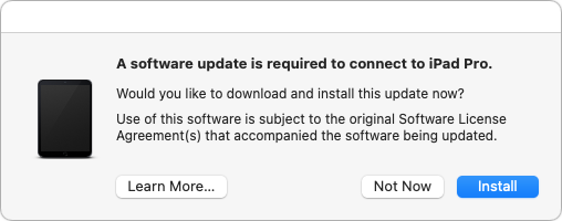
In what seems to be an effort to reduce the confusion level—that MobileDeviceUpdater dialog must have caused innumerable support calls from people worried about malware—Apple is now offering the update via Software Update. No longer do you have to wait until you plug in an iPhone, iPad, or iPod touch to get the Device Support Update (as we now know it’s called).
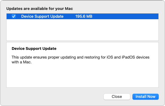
I’ve been sitting on that update for a week or two now since I wanted to verify what it was. I got that chance today when I plugged in my iPad Pro and got the usual MobileDeviceUpdater dialog. I made sure that Software Update was still offering me Device Support Update, and then I allowed the MobileDeviceUpdater dialog to update my Mac. After closing and reopening Software Update, the Device Support Update option was gone, confirming that they’re one and the same.
I realize this is far from an earth-shattering discovery, but it’s nice to know for sure what will happen when installing the Device Support Update from Software Update. It doesn’t require a reboot, and there’s no worry if you don’t get around to it because MobileDeviceUpdater will do its thing the next time you plug in your device.
Apple Releases macOS 12 Monterey with iOS 15.1, iPadOS 15.1, watchOS 8.1, tvOS 15.1, and HomePod Software 15.1
Apple has released macOS 12.0.1 Monterey, iOS 15.1, iPadOS 15.1, watchOS 8.1, and tvOS 15.1. The iOS, iPadOS, and tvOS updates mark the debut of the delayed SharePlay, which remains in testing on macOS. Monterey brings the Shortcuts app to the Mac, along with other features first introduced in iOS 15.
macOS 12 Monterey Adds Shortcuts and AirPlay Reception
As promised, Apple today threw back the curtains on macOS 12 Monterey. We won’t attempt to reiterate all the changes that Apple lists on its Monterey feature page. Most of the new features will sound familiar because they’re shared with iOS 15 and iPadOS 15, including Shared with You, Focus, tags in Notes, Quick Note, Live Text, and so on.
Here are some of the most interesting Monterey highlights:
- Apple has at long last brought the Shortcuts app to the Mac. It currently exists alongside the moribund Automator, but you can convert Automator workflows into shortcuts, a strong hint of where Apple is going with Mac automation. We haven’t had a chance to do a deep dive into Shortcuts for the Mac, but we’re eager to try it out.
- You can now use AirPlay to stream audio and video to a Mac running Monterey. (Previously, you could only stream from a Mac.) However, AirPlay reception works only on the iMac Pro, MacBooks from 2018 and later, the 2019 Mac Pro, 2020 Mac mini, and iMacs from 2019 and later. I’ve been waiting for this feature for years, but sadly, it doesn’t work on my otherwise supported 2016 MacBook Pro.
- In a last-minute revision, Apple recanted on its Safari redesign, bringing back proper tabs and eliminating the interface color changes based on the current website (see “Hot New Features in Safari in iOS 15 and iPadOS 15,” 23 September 2021). If you prefer that redesign, you can get it by choosing Safari > Preferences > Tabs > Compact.
Monterey is the most incremental macOS update in years. macOS 10.15 Catalina dropped support for 32-bit apps, and macOS 11 Big Sur overhauled the macOS interface and added support for Apple silicon. While we recommend that most people wait a while to upgrade from macOS 11 Big Sur in case any major bugs crop up, it’s not the leap into the unknown that the last two macOS versions were. However, if you’ve been hanging on to an older operating system (as I did with 10.14 Mojave for two years), you should be planning when and how you’ll upgrade (see “Why You Should Upgrade (On Your Own Terms),” 4 September 2015).
The only major bug I’ve experienced with Monterey has been in Notes, where none of my notes would show up. This may have merely been a beta quirk, but I fixed it by closing Notes, turning off Notes in System Preferences > Apple ID > iCloud, opening Notes, closing Notes, and then turning Notes syncing back on.
If you want to live on the bleeding edge, you can install Monterey in System Preferences > Software Update. It weighs in at a whopping 12.13 GB on my 2019 iMac running Big Sur. Block out plenty of time for the upgrade—it won’t be quick. Or do as we recommend and hold off for a while.
iOS 15.1 and iPadOS 15.1 Add SharePlay, Enhance HomeKit
The big news for iOS 15.1 and iPadOS 15.1 is SharePlay and FaceTime screen sharing, two features delayed from the initial releases. SharePlay lets you play a movie from the TV app or music from the Music app over a FaceTime connection, while FaceTime screen sharing is just what you’d expect—the option to share screens over a FaceTime connection.
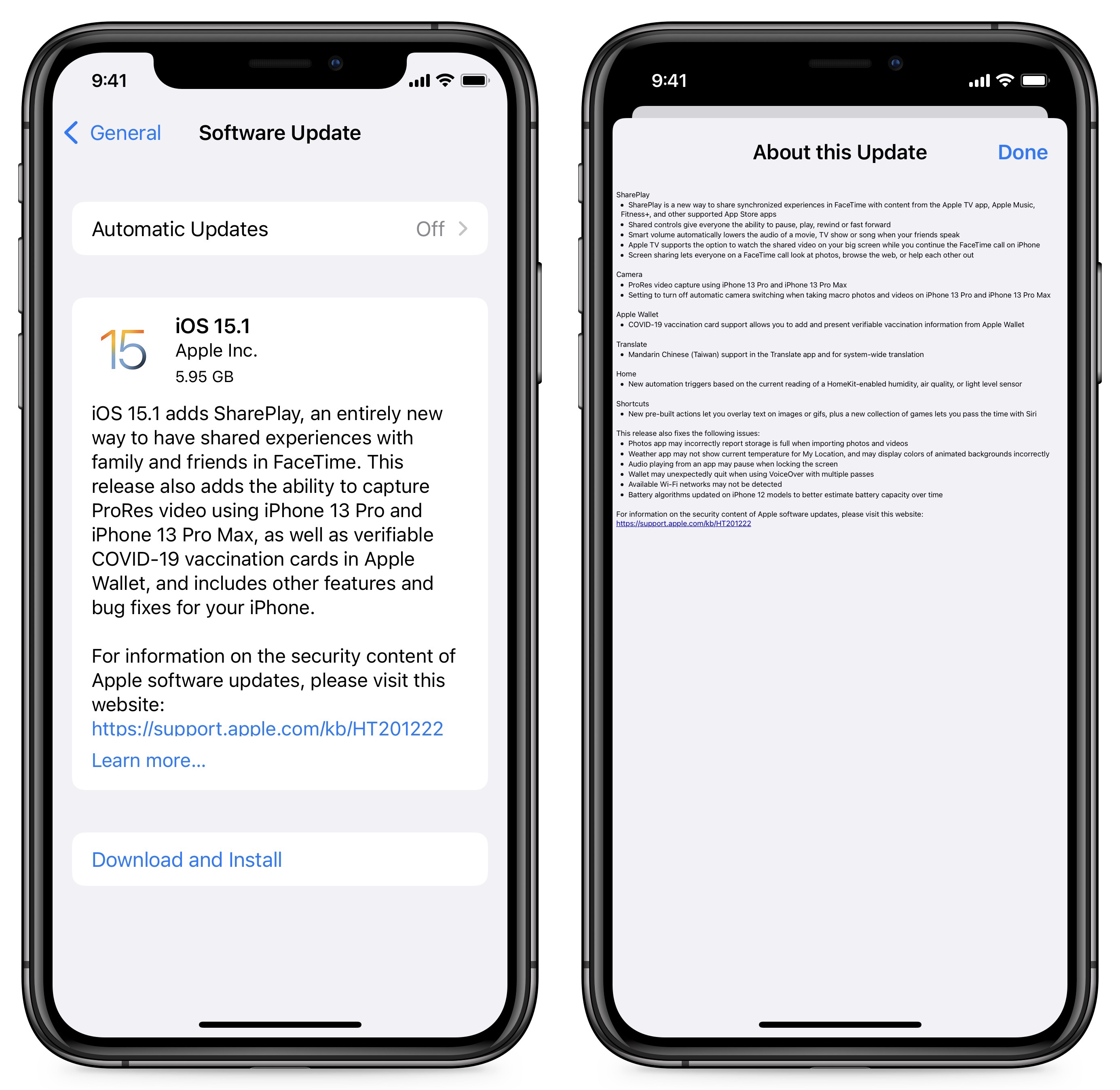
Another feature that some people will appreciate is the option to store a COVID-19 vaccination card in Wallet, initiating it from the Health app. The catch is that the organization that administered your vaccine must either be integrated into Apple Health or send you a SMART Health Card. You can open such a Health card in the Files app to start adding it to Health and Wallet. If your provider is registered with Apple Health, you can import your health records, including vaccination records, in Health > Browse > Add Account (at the bottom, under Health Records).
Some owners of the iPhone 13 Pro and iPhone 13 Pro Max will be happy that iOS 15.1 lets you turn off the automatic camera switching to enable the camera’s macro mode, although the switching seems smoother as well. The update also enables video capture using ProRes on those phones.
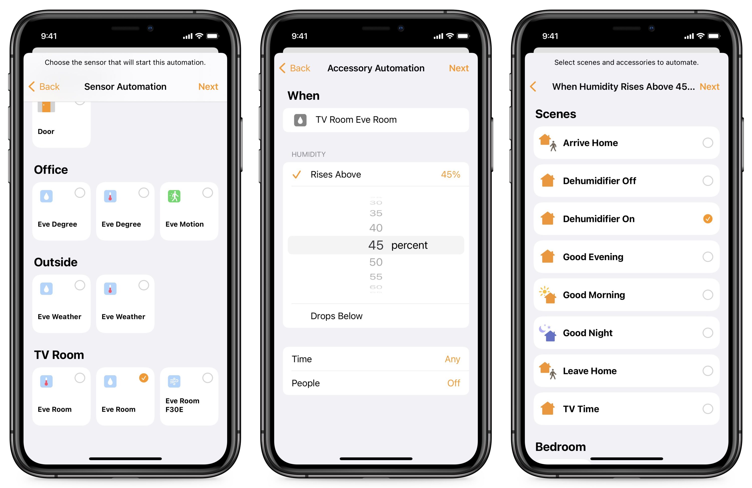
iOS 15.1 and iPadOS 15.1 also introduce some exciting new HomeKit features. For years I’ve had to jump through hoops to make HomeKit automations that would turn on the dehumidifier in my damp underground TV room, even though that capability is part of the backend system (see “A Prairie HomeKit Companion: The Elgato Eve Room,” 19 June 2017). Apple has finally made it so you can add automations based on air quality, humidity, or light level. You need a sensor like an Eve Room, which can detect air quality, humidity, and temperature. Then open Home and go to Automation, tap the plus icon, choose Add Automation, and then A Sensor Detects Something.
iOS 15.1 and iPadOS 15.1 also fix some bugs:
- Photos incorrectly warning you that “storage is full” when importing photos and videos
- Weather showing the wrong temperature or wrong colors in animated backgrounds
- Audio pausing when you unlock the screen
- Wallet crashing if you’re using multiple passes and VoiceOver
- Wi-Fi networks not being detected
- Inaccurate estimates of battery capacity on the iPhone 12
In my testing, iOS 15.1 has proven a bit buggier than previous versions. For example, sometimes, search doesn’t work at all. I recommend holding off a bit unless there’s a feature or bug fix you need or want—perhaps we’ll see version 15.1.1 fairly soon. You can install the iOS 15.1 update (1.44 GB on an iPhone 13 Pro) and the iPadOS 15.1 update (1.13 GB on a 10.5-inch iPad Pro) in Settings > General > Software Update.
watchOS 8.1 Largely Follows iOS 15.1 Features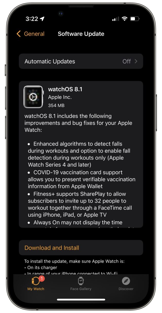
The watchOS 8.1 update is less exciting than macOS, iOS, and iPadOS. It includes:
- An improved fall detection algorithm on the Apple Watch Series 4 and later
- Support for displaying COVID-19 vaccine cards stored in the iPhone’s Wallet app
- SharePlay support for Apple Fitness+, which lets up to 32 people work out together
- A fix for a bug that caused the always-on display to fail to show the time correctly on the Apple Watch Series 5 and later
You can install the update (354 MB on an Apple Watch Series 5) by going to My Watch > General > Software Update in the Watch app on your iPhone. Make sure your watch is connected to its charger and charged to at least 50%.
tvOS 15.1 Adds SharePlay Support
As always, the tvOS update is a bit mysterious, but we know tvOS 15.1 includes support for SharePlay. You can install it by going to Settings > System > Software Update, or just let it install on its own.
When SharePlay content is playing on an iPhone or iPad, you can view it on your Apple TV by opening Control Center (press and hold the TV button on the remote) and selecting the SharePlay item.
HomePod Software 15.1 Gains Spatial Audio
Apple has also released HomePod Software 15.1, which adds support for spatial audio with Dolby Atmos and lossless playback from Apple Music. The 467.7 MB update should install on its own soon enough, but you can force it to install by opening the Home app, and if an Update Available button appears, tapping it. Otherwise, touch and hold the HomePod tile, tap the gear icon to display the settings, and then tap Update near the top of the screen.
9to5Mac reports that, despite what the release notes say, the HomePod mini doesn’t support Atmos unless you connect a pair to an Apple TV and initiate playback from the Apple TV. We’re hoping that’s a bug since the hardware is capable of spatial audio output, and it’s weird to enable a feature for a discontinued product but not the current product. (It’s also odd that there’s a HomePod mini without a HomePod. Perhaps Apple hasn’t entirely given up on the big HomePod just yet.)
1Password 7.9 Adds Secure Password Sharing
Five years ago, in “Share Passwords Securely with One-Time Secret” (13 June 2016), I wrote about One-Time Secret and d-note, which allow you to share a password—or any text—without worrying about it being intercepted or revealed in an email breach. This capability is essential when you’re in a group whose account access credentials need to be shared with people whose technical platform you might not even know.
Here’s how these password-sharing services work. You enter the password in a Web form, click a Generate button, copy the provided URL, and send the link to the recipient. When they click the link, the site shows them the password and immediately deletes the database entry to ensure no one else can ever use that link again. Although this is highly unlikely, if the recipient tells you that they couldn’t retrieve the link, you know someone intercepted your message, and you can change the password in question.
I’ve taken to using yet another similar service—1ty.me—which until recently allowed you to enter your email address and receive a notification of when the recipient accessed the password. I have no idea why the feature disappeared, but I liked getting the notification that the recipient had indeed retrieved the password.
In that article about One-Time Secret, I wrote:
The problem I solve with One-Time Secret is infrequent, one-off password sharing with people whose technical setup I seldom know. If you want to share passwords more regularly, better password managers like 1Password and LastPass simplify sharing as long as everyone uses the same app. In an ideal world, 1Password and LastPass would integrate the code from One-Time Secret or d-note into future versions to provide ad-hoc password sharing too.
It has taken a long time, but 1Password 7.9, which AgileBits recently released, finally adds secure password sharing, even with people who don’t use 1Password. The interfaces differ slightly between 1Password.com, the Mac version of 1Password, and the iOS and iPadOS versions, but here are the basics of how to use it.

Share a Password Securely
AgileBits did a good job of making secure password sharing easy:
- Select an item in your 1Password vault (in iOS, tap Categories if necessary).
- Tap the Share button (iOS) or click the Share button and choose Share (macOS and 1Password.com).
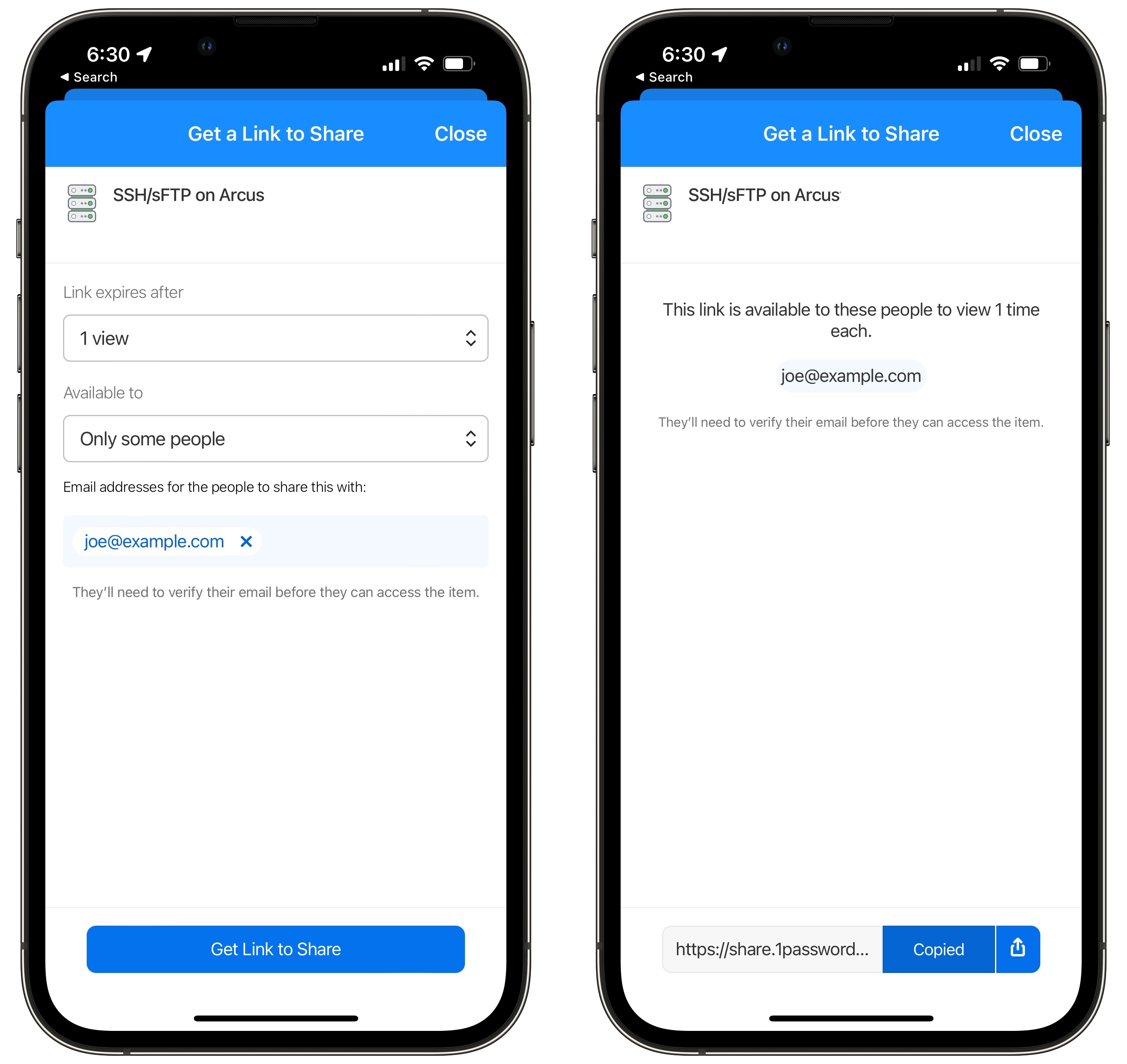
- Choose when the link should expire, either after a single view (like One-Time Secret and the others) or after some span of time. I recommend sticking with a single view in nearly all cases to ensure that the link stops working after one use—anything else opens it up to being seen by multiple people.
- Choose whether the link should be available to anyone or only to specific people. This tweak is an advancement over the competing services since you can specify that the recipient must enter their email address and receive a verification code before revealing the password. That raises the bar on interception since the attacker must also know the intended recipient’s address. However, it also makes retrieving the password a two-step process for the recipient, so you have to weigh the annoyance value against the added security.
- Tap or click Get Link to Share.
- In the next screen, tap or click the Copy button at the bottom, which helpfully changes to Copied.
- Send the link to the recipient however you like. For higher security, don’t send it in the same channel as the rest of the login information—for instance, send most of the login details in email and the password link via an end-to-end encrypted system like iMessage. That way, if an attacker does intercept or hack the recipient’s email before they see the message, the account remains secure.
Access a Shared Password
How you access a shared password depends on whether or not the sender restricted it to a specific set of people. If they didn’t, just click the provided link, tap or click the password field, and copy the password, as in the rightmost screen below. It’s best to verify that it works immediately and add it to your own password manager.
More interesting is what happens if the sender limited the set of recipients. In that case, follow these steps:
- Tap or click the provided link to open it in your Web browser.
- Enter your email address and click or tap Send Code.
- Switch to your email and copy the six-digit code from the message you received.
- Switch back to your Web browser and enter the code.
- 1Password displays the login information, with the password concealed; tap or click it to bring up options for Copy and Reveal.
- Copy the password and immediately try logging into the account in question to verify that it works and so you can save the password to your password manager.
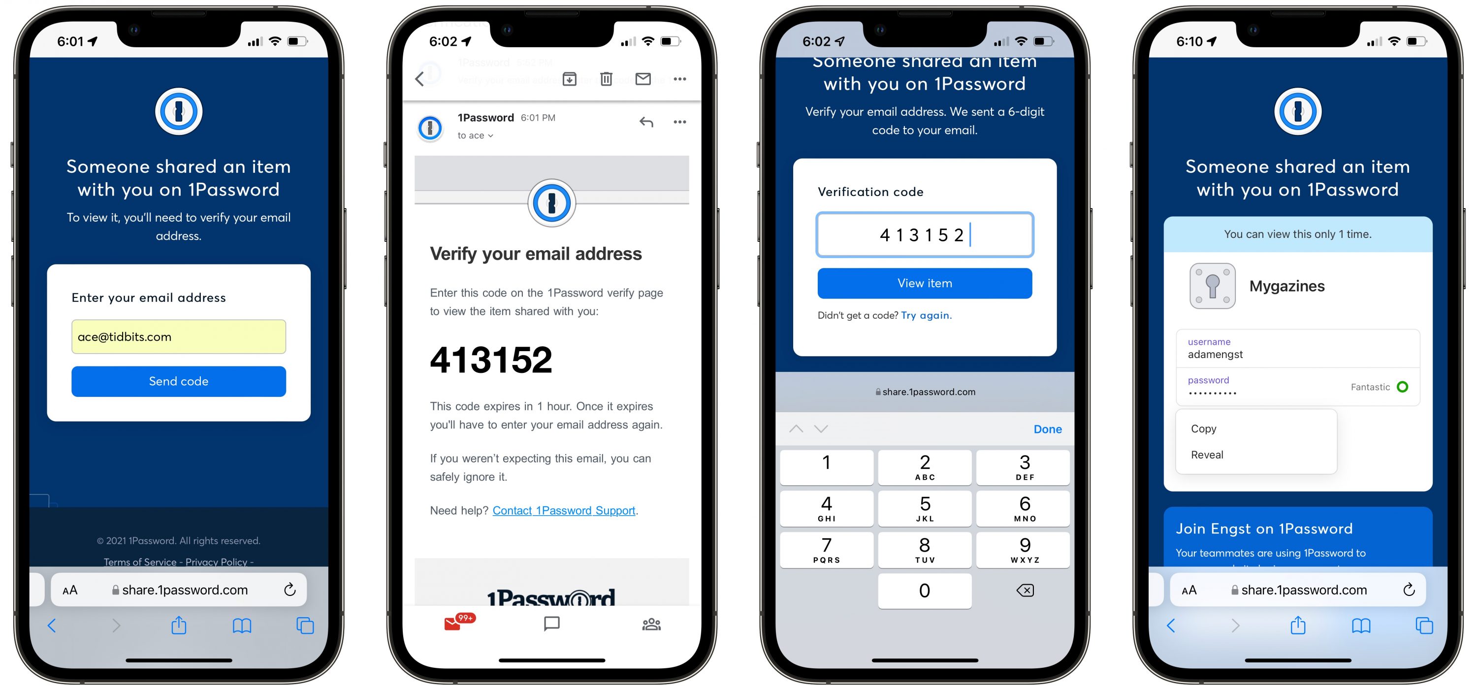
Suppose someone gets hold of a 1Password shared password link but doesn’t enter the email address of an approved recipient. In that case, they’ll receive an email message telling them the item wasn’t shared with that address instead of the verification code.
The only thing I’d like to see AgileBits add to this system is an optional notification that a shared password was retrieved. I found that quite reassuring with 1ty.me because it helped me close the loop and know that my recipient was moving forward with the login task.
Otherwise, AgileBits has done an excellent job with this password-sharing feature, and it’s surprising that LastPass and other password managers haven’t done something similar.
Charts in Apple’s Numbers Spreadsheet: Which One When?
Apple’s Numbers spreadsheet app offers a wide variety of charts to help interpret the data in its tables (as does its Pages word processor). But when you want to turn numbers into pictures, you need to use the right kind of picture in order to get the information across.
Standard Charts
Everyone’s familiar with the common line, bar, and pie charts, but familiarity doesn’t necessarily lead to understanding which one makes the most sense in a given situation. And what about their offshoots—area charts, stacked bars, and donuts? Pick the wrong one, and your readers might not be able to draw any conclusions or, perhaps worse, could draw the wrong conclusion.
Line Charts
You know what a line chart is; you might even know that its main use is to highlight the rate of change over time, for either a single item or in a comparison of multiple items.
Column and Bar Charts
Use a column (vertical) or bar (horizontal) chart to compare data by group or category: the output of Widget Factories A, B, and C; starting salaries of popular post-grad degree holders; or the monthly average rainfall in your city for each month last year.
Choosing one of these over the other is usually a practical issue: what fits better on a printed page or Web page, or whether you need to accommodate a long label.
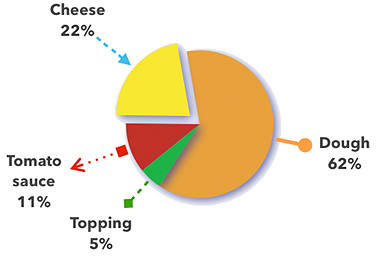
Pie Charts
Pie charts are elegant in their simplicity but are easily misused. We call them pie charts instead of “circular graphs” for a reason: the data represented by the slices makes a whole something. So, use a pie chart when you want to show how a total something is divvied up, not when you’re looking at how a value changes over time. An “exploded” pie chart sounds messy, but it simply has one or more of its slices pulled out for emphasis or general visual effect.
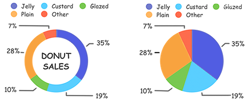
Donut Charts
Like pie charts, donut charts help readers see how a total something is divvied up. There’s controversy as to their efficacy—whether the arcs of a donut chart’s ring are easier or harder to interpret than the wedges of a pie chart. (But then, some experts also disdain the common pie chart on general interpretational principles.)
I think the pie is easier to understand and that you should restrict your use of donut charts to when the differences between arcs are large enough to remain obvious. In this figure, for instance, it’s easier to see the size difference between the orange and dark blue pie wedges than between those colors in the donut ring. Of course, you’d label each wedge/arc with the number it represents, but the mark of a good chart is its ability to convey information visually.
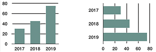
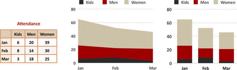
Stacked Column and Bar Charts
A single stacked column or bar is like a (misshapen) pie chart: it lets you see how much of a whole something is divvied up. Using multiple stacked columns or bars in a chart enables you to include information about the overall totals too, signified by the column/bar size, as well as the size of each column/bar’s components. The three charts in this figure show: data for each of three years, a breakdown of the data for those years, and a combination of the information in the first two charts.

You might wonder whether you should present data in a line chart or a column/bar chart. When your goal is to emphasize changes over time, use a line chart; if you want to concentrate on totals at discrete points in time, use a column/bar chart.
Area Charts
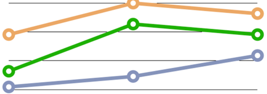
An area chart would seem to be simply a line chart that’s filled in with color—and, well, it is. But don’t use it to represent more than one data set unless one set is smaller than the other at all its points. Consider the problem with just two data sets, as shown in the figure below. The background data set is obscured for all except its first and last years. The background data could be nearly the same, but just a little lower at all its points, or it could be drastically different at some or all points. The only clue offered, based on the slope we can see, is that there was a gradual rise from the penultimate to the final number.
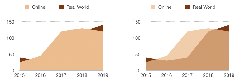
In addition, area charts with multiple data sets often give the wrong impression. You see much more of the frontmost set, so even if at all points it’s smaller than the background set, a quick visual takeaway can be that its data set is the larger one.
Advanced Charts
You might not be as familiar with these lesser-known chart types; they’re used much less frequently. That could be because they’re more prone to being misunderstood by viewers—as well as some creators.
Stacked Area and Stacked Bar Charts
A stacked area chart is like a stacked column/bar chart (which is like a pie chart, despite the shape difference): it shows how much of the whole each x-axis data value represents. But this type of chart has all the interpretation problems inherent to a standard area chart, along with some issues of its own. Avoid stacked area charts unless you’re an expert. And if you are an expert, avoid it if your viewers are not. Consider a stacked column/bar chart instead.
The figure below demonstrates one of the interpretation problems with this chart type. You can see that the red band dipped down in February. However, since your eye naturally follows the top of the band, you may not consider that it’s also pinched in from the bottom, which affects your interpretation of how sharp the drop is. The stacked column chart version, however, clearly shows how narrow February’s red band is compared to the months before and after.
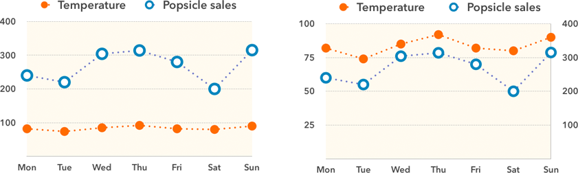
Dual-Axis Charts
A dual, or 2-axis, chart uses two y-axes, one on each side of the chart. It’s meant to compare two things that use entirely different scales on their y-axes, either because they use different units of measure (such as the weather and popsicle sales shown here) or because they span very different ranges on the same numeric scale. Here’s a wonderful treatise on why these charts shouldn’t be used at all (except perhaps for unimportant things like popsicle sales). The main objection is that people frequently misinterpret these charts because they don’t know how to read them or have trouble comparing the two axes. So, the main rule when using a dual-axis chart is: Know Thy Audience.
At least, that’s my official advice. But I tested the figure above on several non-geek, non-math friends (a graphic designer, a German-language professor, and 16- and 11-year-old sisters), and no one had a problem understanding the dual-axis chart. While that might be a function of the small number of data points, or because I showed the original single-axis chart version for comparison, or perhaps even their innate understanding of what would happen to popsicle sales as the temperature rises, I think it indicates that you shouldn’t be automatically scared away from this chart option.
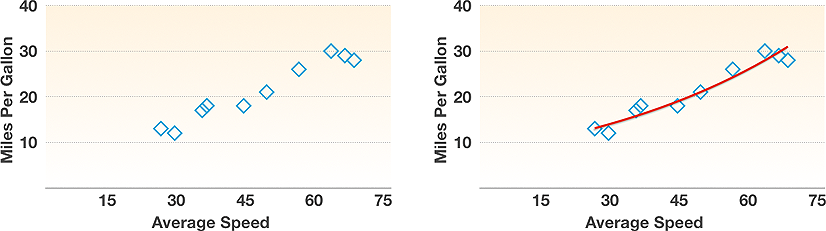
Scatter Charts
A scatter chart (also known as an x-y plot) maps pairs of coordinates to show relationships between the things being measured: rain and fungus growth rate, or a car’s average speed and its fuel consumption. In a scatter chart, instead of two series of numbers plotted along a line, the chart plots the first number from each series together, then the second-number pair, and so on; they’re great for showing clusters and outliers. It’s common practice to plot a best-fit line, or trend line, through the points on a scatter chart to emphasize a trend. But avoid trend lines unless you’re well versed in the details of what they mean: Numbers, for instance, offers six kinds of trend lines, including linear, logarithmic, and polynomial.
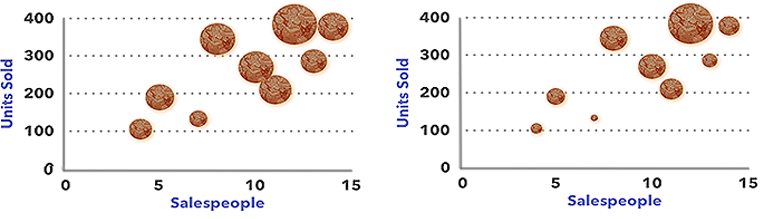
Bubble Charts
A bubble chart is basically a scatter chart whose data has an embedded third data set included. The numbers from the first two data sets are used to plot the x,y coordinates for a bubble’s center point; the third (the z value) is represented by the bubble’s size.
Bubble charts can be difficult to interpret. Is it the diameter or the area of the circle that counts? Sure, they’re mathematically intertwined, but if you don’t know which one was used for the chart, you can’t tell how much of a difference in bubble size depicts how much of a difference in the data. (My brief research into the matter says that we humans can’t help but react to the area, even if we know it’s the diameter that counts.)
You can see the big difference between the approaches in these two charts, which use the same data. The x and y coordinates show the number of salespeople and the number of various items sold. The items, however, vary in price, so the size of a bubble indicates the amount of money generated. Since the various “units” being sold have different prices, it’s the only way to include that information in the chart.
On the left, the bubble area represents the same number as the bubble diameter stands for on the right. The one on the left illustrates another problem with this chart type: two bubbles are touching, which can skew the perception of how large a number either represents—and that’s nothing compared to the interpretation problem when bubbles actually overlap.
Now that you know which chart to use when, learn how to turn your Numbers table data into charts (including nifty interactive versions of some of these chart types) in Take Control of Numbers, Third Edition.